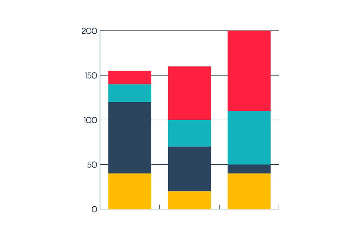
Stacked column charts are a type of vertical bar chart where individual data series are stacked on top of each other within a single column. Each column represents a category, while the stacked segments show the contribution of individual subcategories to the total. These charts are highly effective for visualizing part-to-whole relationships across multiple categories, as well as comparing overall totals and subcategory proportions.
General Overview of Stacked Column Charts
Visualization Name: Stacked Column Chart
Visualization Category: Comparison
Types of Stacked Column Charts
- Simple Stacked Column Chart: Columns are stacked vertically, showing absolute values for each subcategory and their cumulative total.
- 100% Stacked Column Chart: Columns are normalized to 100%, emphasizing the proportion of subcategories rather than absolute values.
Definition of Use Case
Stacked column charts are used to display the composition of categories and their subcategories, while also visualizing cumulative totals. They are particularly effective for comparing how components contribute to the whole.
Why Use a Stacked Column Chart?
Stacked column charts combine detail and summary in a single visualization, providing both overall trends and subcategory breakdowns. They are especially useful when part-to-whole relationships need to be emphasized or when comparing cumulative totals across categories.
Significance in Data Analysis
Stacked column charts are valuable for analyzing aggregated data, identifying trends, and comparing contributions across categories. They are widely applied in finance, business, education, and other fields where part-to-whole insights are crucial.
Structure and Components of a Stacked Column Chart
Key Elements
- X-Axis (Categories): Represents the categories being analyzed.
- Y-Axis (Values): Indicates the cumulative values of the stacked columns or proportions in a 100% stacked chart.
- Columns: Vertical bars divided into segments, with each segment representing a subcategory.
- Colors: Differentiate between subcategories and make the chart visually interpretable.
- Legend: Explains the meaning of colors and identifies subcategories.
- Gridlines: Provide a reference to compare values across categories.
Usage Scenarios
When to Use a Stacked Column Chart?
- Part-to-Whole Analysis: Comparing the contributions of subcategories (e.g., product lines) to total revenue.
- Performance Metrics: Displaying department-wise expenses segmented by cost type.
- Demographic Studies: Analyzing population distribution by age group and gender across regions.
- Market Insights: Showing market share contributions from multiple companies within each category.
- Survey Results: Visualizing survey responses segmented by demographic factors like age or income.
When Not to Use a Stacked Column Chart?
- Detailed Comparisons Across Subcategories: Clustered column charts are better for side-by-side comparisons.
- Continuous Data: Line charts are more suitable for showing trends over time.
- Overcrowded Data: Too many subcategories can make the chart hard to interpret.
- Precise Subcategory Values: If exact subcategory values are needed, other charts like grouped bar charts are better.
- Proportion Comparisons Across Multiple Categories: 100% stacked column charts or pie charts may be more effective.
Interpretation Guidelines
- Look at Column Height: The height of the column represents the total value of the category.
- Analyze Segment Sizes: Focus on the size of each segment to assess subcategory contributions.
- Use the Legend: Refer to the legend for identifying subcategories and their colors.
- Compare Across Categories: Look for differences in totals and segment proportions between columns.
- Check Scaling: Ensure consistent scaling of the y-axis for accurate comparisons.
Strengths and Weaknesses of Stacked Column Charts
Advantages
- Part-to-Whole Insights: Effectively shows the composition of each category and the overall totals.
- Efficient Visualization: Combines cumulative totals and individual subcategory data in one chart.
- Customizable: Colors, labels, and annotations enhance clarity and usability.
- Versatile: Works well in a wide variety of applications, from financial data to survey results.
- Space-Saving: Summarizes data without requiring multiple charts for categories and subcategories.
Limitations
- Difficulty Comparing Subcategories: Comparing individual subcategories across columns can be challenging.
- Cluttered Appearance: Too many segments within columns can reduce readability.
- Limited Precision: Exact subcategory values may not be clear without annotations.
- Scaling Issues: Inconsistent scaling can distort insights and make comparisons misleading.
- Static Nature: Does not show dynamic changes or continuous trends effectively.
Design Best Practices
- Limit Subcategories: Keep the number of segments manageable to avoid clutter.
- Label Clearly: Ensure all axes, columns, and subcategories are labeled for clarity.
- Apply Consistent Colors: Use distinct and consistent colors for subcategories across columns.
- Provide a Legend: Include a clear legend to identify subcategories and their corresponding colors.
- Optimize Axes: Start the y-axis at zero and ensure proper scaling for accurate representation.
Examples of Stacked Column Charts
Simple Examples
- Sales Analysis: Columns showing total sales broken down by online and in-store channels.
- Expense Breakdown: Monthly expenses categorized by rent, salaries, and utilities.
- Survey Results: Visualization of survey responses segmented by demographic groups.
- Market Share: Columns showing total market share with contributions from different brands.
- Population Analysis: Demographics by region, with age and gender segments.
Advanced Examples
- Budget Allocation: Columns showing yearly budgets for multiple departments segmented by cost type.
- Regional Sales Trends: Sales data broken down by product line across different regions.
- Energy Usage: Energy consumption segmented by source (e.g., solar, wind, coal) over multiple years.
- Healthcare Data: Patient outcomes categorized by treatment type and hospital location.
- Operational KPIs: Yearly efficiency metrics segmented by team or department.
Comparison with Similar Visualizations
Similarities
- Stacked Column vs. Clustered Column Charts: Both compare subcategories across categories; the difference lies in presentation (stacked for cumulative totals, clustered for side-by-side comparisons).
- Stacked Column vs. Standard Column Charts: Both use vertical bars, but stacked charts add detail by segmenting subcategories.
- Stacked Column vs. Stacked Bar Charts: Both use stacking for part-to-whole analysis; the difference is orientation (vertical vs. horizontal).
- Stacked Column vs. Pie Charts: Both show proportions, but stacked column charts can compare proportions across multiple categories.
- Stacked Column vs. Line Charts: Both show trends, but line charts emphasize continuous data while stacked column charts focus on categories and subcategories.
Differences
- Stacked Column vs. Clustered Column Charts: Clustered charts separate subcategories side by side, while stacked charts layer them within one column.
- Stacked Column vs. Standard Column Charts: Standard column charts lack subcategory breakdowns, focusing only on category totals.
- Stacked Column vs. Stacked Bar Charts: The primary difference is orientation, with stacked bar charts being horizontal.
- Stacked Column vs. Pie Charts: Pie charts are limited to one category at a time, while stacked column charts allow for multiple-category comparisons.
- Stacked Column vs. Line Charts: Line charts are better suited for continuous trends over time, while stacked column charts emphasize discrete categories.
Conclusion
Stacked column charts are a versatile and powerful tool for visualizing part-to-whole relationships across multiple categories. By combining total and segmented data in a single visualization, they provide detailed insights into category composition and overall trends. With proper design and clear labeling, stacked column charts can effectively communicate complex data, making them indispensable in business, research, and analytics.