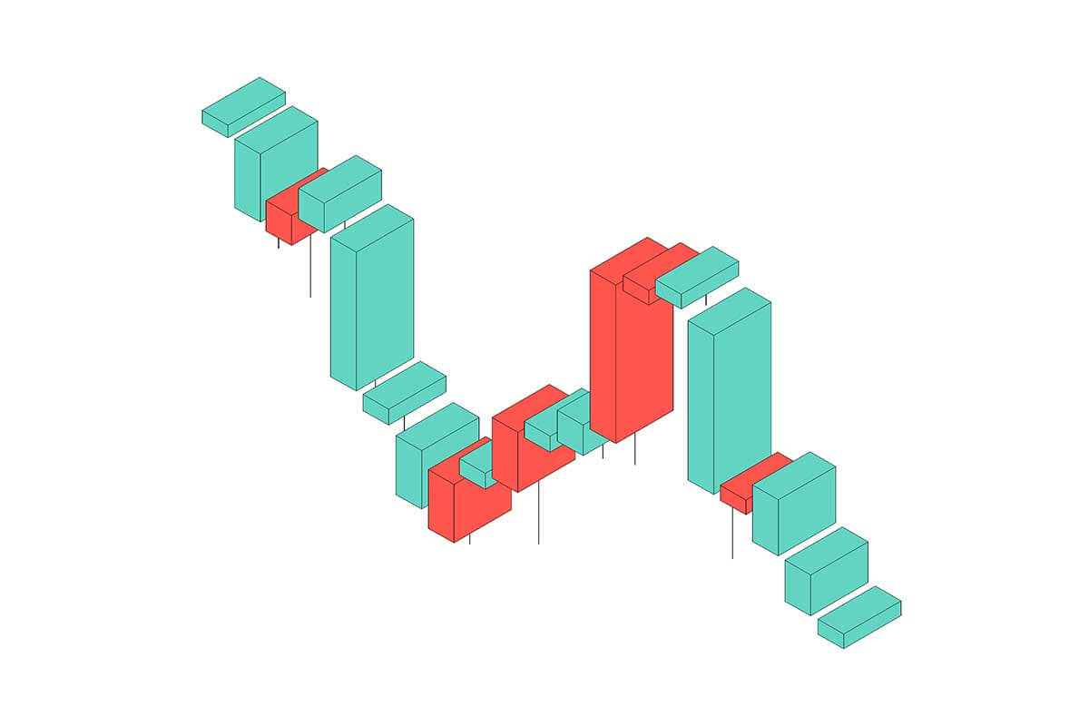
Waterfall charts are a specialized type of bar chart that visually demonstrate how an initial value is affected by a series of intermediate positive and negative changes, leading to a final value. Each bar connects to the next, creating a “stepped” appearance, which is ideal for breaking down components of a value or showing cumulative effects over time. This chart is highly effective for analyzing financial data, process changes, or any scenario involving sequential contributions.
General Overview of Waterfall Charts
Visualization Name: Waterfall Chart
Visualization Category: Part-to-Whole
Types of Waterfall Charts
- Simple Waterfall Chart: Displays contributions of positive and negative values to a total.
- Stacked Waterfall Chart: Breaks down each step further by segmenting bars into subcategories.
- Horizontal Waterfall Chart: A horizontal version of the waterfall chart, used when labels are lengthy or for better layout fit.
Definition of Use Case
Waterfall charts are used to visually illustrate how a series of sequential factors or components contribute to a final result. They are particularly effective for analyzing financial statements, process improvements, or comparing cumulative changes.
Why Use a Waterfall Chart?
Waterfall charts are excellent for illustrating the cumulative effect of data points in a sequential process. They simplify complex data by visually showing contributions, helping decision-makers understand key drivers of change.
Significance in Data Analysis
Waterfall charts are indispensable tools for understanding the components of a total value and pinpointing the impact of positive and negative factors. They are widely used in financial analysis, strategic planning, and operational improvement initiatives.
Structure and Components of a Waterfall Chart
Key Elements
- Categories (X-Axis): Represents the sequential steps or components being analyzed.
- Values (Y-Axis): Indicates the magnitude of changes (positive or negative) and cumulative totals.
- Bars: Represent individual contributions to the overall value, with color-coded positive and negative changes.
- Connecting Lines: Show the cumulative flow between bars, creating the “stepped” appearance.
- Base Values: Starting and ending values to provide context for changes.
- Colors: Differentiate between increases, decreases, and totals.
Usage Scenarios
When to Use a Waterfall Chart?
- Financial Analysis: Showing how revenue or profit is affected by expenses, taxes, and other factors.
- Budgeting: Breaking down cost contributions to total budget changes.
- Process Improvements: Visualizing how process steps contribute to overall efficiency gains or losses.
- Operational Analysis: Illustrating the effect of variable factors like production costs or labor on total output.
- Strategic Planning: Explaining the impact of market drivers or operational decisions on projected outcomes.
When Not to Use a Waterfall Chart?
- Large Datasets: Overcrowding can make the chart difficult to interpret.
- Unordered Data: Waterfall charts are not suitable for categories without a clear sequence.
- Complex Relationships: Scatter plots or network diagrams are better for analyzing interdependent variables.
- Proportional Data: Pie or 100% stacked bar charts are more effective for visualizing proportions.
- Time Series Analysis: Line charts are better for tracking trends over time.
Interpretation Guidelines
- Identify Starting Point: Understand the initial value and its significance to the data context.
- Analyze Bar Colors: Positive changes are usually green, and negative changes are red, helping to identify key drivers quickly.
- Follow the Steps: Trace the cumulative changes step by step to understand how intermediate factors contribute to the final value.
- Focus on Totals: The final bar often summarizes the cumulative impact of all changes.
- Look for Patterns: Identify recurring positive or negative trends that may require action or further analysis.
Strengths and Weaknesses of Waterfall Charts
Advantages
- Sequential Clarity: Clearly illustrates how individual components contribute to a total.
- Effective Communication: Simplifies complex data into an intuitive visual representation.
- Customizable: Colors, labels, and annotations can enhance clarity and emphasize key drivers.
- Versatile: Useful across various industries for financial, operational, and strategic analysis.
- Shows Positive and Negative Impacts: Highlights gains and losses in a single view.
Limitations
- Overcrowding: Too many steps can make the chart visually overwhelming.
- Limited Comparisons: Not ideal for comparing multiple datasets or categories side by side.
- Scaling Issues: Large differences in values can distort smaller components.
- Static Data: Focuses on cumulative contributions rather than dynamic trends.
- Specialized Use Case: May not be the best choice for general-purpose visualizations.
Design Best Practices
- Keep It Simple: Limit the number of steps to maintain clarity and readability.
- Use Distinct Colors: Apply clear and consistent color coding for positive, negative, and total values.
- Label Clearly: Provide descriptive labels for all categories, bars, and totals.
- Include Totals: Highlight starting and ending values for context.
- Optimize Axis Scaling: Ensure the y-axis is scaled appropriately to avoid misrepresentation of changes.
Examples of Waterfall Charts
Simple Examples
- Profit Analysis: Visualizing how revenues and expenses contribute to net profit.
- Budget Changes: Breaking down changes in departmental budgets over a fiscal year.
- Cost Analysis: Illustrating the impact of variable costs, fixed costs, and other factors on total cost.
- Revenue Growth: Showing how customer acquisitions, churn, and pricing changes affect revenue.
- Savings Breakdown: Displaying how individual savings initiatives contribute to overall cost reduction.
Advanced Examples
- Financial Statements: Breaking down earnings before interest, taxes, depreciation, and amortization (EBITDA) into component parts.
- Operational Efficiency: Analyzing the effect of process improvements on production costs and output.
- Strategic Drivers: Visualizing how market expansion, product development, and operational changes impact business growth.
- Investment Returns: Showing how individual investments contribute to total portfolio performance.
- Risk Analysis: Highlighting the positive and negative impacts of risk factors on project outcomes.
Comparison with Similar Visualizations
Similarities
- Waterfall vs. Bar Charts: Both use bars to represent data, but waterfall charts show cumulative effects, while bar charts are static comparisons.
- Waterfall vs. Stacked Bar Charts: Both can display part-to-whole relationships, but waterfall charts emphasize the sequential flow of data.
- Waterfall vs. Line Charts: Both can represent trends, though waterfall charts focus on cumulative changes, while line charts are better for continuous data.
- Waterfall vs. Gantt Charts: Both show sequences, but Gantt charts focus on timelines, while waterfall charts highlight data changes.
- Waterfall vs. Area Charts: Both can visualize changes over time, but waterfall charts highlight individual contributions to a total.
Differences
- Waterfall vs. Bar Charts: Bar charts display static values, while waterfall charts emphasize the flow of positive and negative changes to a cumulative total.
- Waterfall vs. Stacked Bar Charts: Stacked bar charts group values within a single category, while waterfall charts track sequential changes across categories.
- Waterfall vs. Line Charts: Line charts are better for showing trends over time, whereas waterfall charts focus on part-to-whole relationships.
- Waterfall vs. Gantt Charts: Gantt charts are timeline-based, while waterfall charts analyze numerical changes.
- Waterfall vs. Area Charts: Area charts focus on cumulative data visualization over time, while waterfall charts emphasize step-by-step contributions.