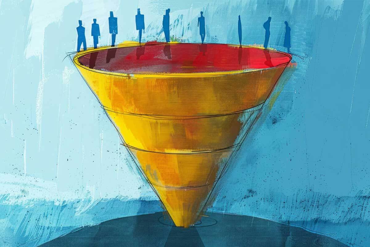
Funnel charts are a type of data visualization used to represent a process or workflow with multiple stages, where each stage narrows to indicate decreasing quantities or proportions. The chart is shaped like a funnel, with the widest section at the top representing the initial stage and progressively narrower sections below showing subsequent stages. Funnel charts are particularly effective for identifying bottlenecks, drop-offs, or conversion rates in processes.
General Overview of Funnel Charts
Visualization Name: Funnel Chart
Visualization Category: Flow
Types of Funnel Charts
- Simple Funnel Chart: Displays a linear sequence of stages with decreasing values from top to bottom.
- 3D Funnel Chart: Adds a three-dimensional perspective for visual impact while retaining the funnel structure.
- Trapezoidal Funnel Chart: Uses trapezoidal sections to better represent the proportional difference between stages.
- Horizontal Funnel Chart: Rotates the funnel layout horizontally for better readability in certain contexts.
- Stacked Funnel Chart: Breaks down each stage further by adding subcategories within each section.
Definition of Use Case
Funnel charts are used to visualize processes that involve multiple stages, such as sales pipelines, user journeys, or workflows. They are especially useful for highlighting drop-off rates or identifying stages that require optimization.
Why Use a Funnel Chart?
Funnel charts make it easy to visualize and analyze sequential processes with clear stage-by-stage comparisons. They are particularly effective in identifying inefficiencies, conversion rates, or attrition points in processes.
Significance in Data Analysis
Funnel charts are essential tools in data analysis for understanding process performance and user behavior. By visually highlighting drop-offs or bottlenecks, they provide actionable insights for process improvement and decision-making.
Structure and Components of a Funnel Chart
Key Elements
- Stages: Represent the different phases or steps in the process being visualized.
- Sections: Funnel segments corresponding to each stage, sized proportionally to the values they represent.
- Width: Indicates the value or quantity at each stage, decreasing as the process progresses.
- Labels: Provide information about the stage name and its corresponding value or percentage.
- Colors: Differentiate stages or categories within the funnel, improving clarity.
Usage Scenarios
When to Use a Funnel Chart?
- Sales Funnels: Visualizing customer journeys through a sales pipeline, from leads to closed deals.
- Marketing Campaigns: Analyzing the stages of a marketing funnel, such as impressions, clicks, and conversions.
- User Journeys: Tracking user drop-offs through a sign-up or onboarding process.
- Workflow Analysis: Highlighting inefficiencies in operational workflows or processes.
- Event Funnels: Examining attendance or engagement through sequential stages of an event or program.
When Not to Use a Funnel Chart?
- Non-Sequential Data: Funnel charts are designed for processes with ordered stages; unordered data is better suited for bar or pie charts.
- Too Many Stages: Overcrowding with numerous stages can make the chart confusing and hard to interpret.
- Flat or Increasing Values: If the values don’t decrease sequentially, a funnel chart may misrepresent the data.
- Comparisons Across Groups: Use bar or grouped column charts for clearer comparisons between categories.
- Small Data Sets: Simple comparisons may be better visualized with other chart types like tables or bar charts.
Interpretation Guidelines
- Read Top to Bottom: Start at the widest section to understand the initial stage and progress downward to observe drop-offs.
- Analyze Drop-Offs: Pay attention to significant decreases in width between stages to identify bottlenecks or areas of concern.
- Look at Percentages: Use percentage labels to better understand the relative change between stages.
- Focus on Bottlenecks: Highlight stages with the largest attrition rates for potential optimization opportunities.
- Check Stage Labels: Ensure stage names and values are clearly labeled for accurate interpretation.
Strengths and Weaknesses of Funnel Charts
Advantages
- Visualizes Drop-Offs: Clearly highlights stage-by-stage decreases in quantity or value.
- Simple and Intuitive: Easy for audiences to understand and interpret.
- Focuses on Processes: Effectively represents workflows, pipelines, and conversion funnels.
- Compact Representation: Summarizes multi-stage processes in a single chart.
- Actionable Insights: Identifies bottlenecks and opportunities for process improvement.
Limitations
- Misleading with Flat Values: Funnels may not accurately represent processes where values don’t decrease sequentially.
- Limited Comparisons: Funnel charts are not ideal for comparing data across multiple processes or groups.
- Overcrowding: Too many stages can make the chart visually cluttered.
- Static Representation: Doesn’t provide dynamic insights or real-time interactivity.
- Scaling Challenges: Large differences in values between stages can make smaller sections less visible.
Design Best Practices
- Limit Stages: Focus on the most critical stages to avoid clutter and maintain clarity.
- Use Clear Labels: Include descriptive stage names and corresponding values or percentages for context.
- Choose Distinct Colors: Apply a color scheme that differentiates stages without overwhelming the viewer.
- Start with Large Values: Ensure the initial stage is the widest to reflect the funnel structure accurately.
- Highlight Key Stages: Use annotations or contrasting colors to emphasize significant drop-offs or bottlenecks.
Examples of Funnel Charts
Simple Examples
- Sales Pipeline: Tracking leads through stages such as inquiry, qualification, proposal, and closure.
- Marketing Funnel: Visualizing stages like ad impressions, clicks, website visits, and purchases.
- User Conversion: Showing how users move through an onboarding process, such as registration, setup, and first activity.
- Event Participation: Highlighting attendance through stages such as registrations, confirmations, and actual attendance.
- Operational Workflow: Analyzing task completion rates across sequential steps in a project workflow.
Advanced Examples
- E-commerce Analytics: Tracking user journeys from product views to cart additions, checkouts, and final purchases.
- Customer Support: Showing ticket resolution progress through stages like submission, triage, and closure.
- Healthcare Process: Visualizing patient flow through stages like appointment scheduling, check-in, consultation, and follow-up.
- Financial Analysis: Tracking loan applications from submission to approval and disbursement stages.
- Employee Onboarding: Analyzing the progress of new hires through orientation, training, and first project assignment.
Comparison with Similar Visualizations
Similarities
- Funnel vs. Bar Chart: Both can represent quantities, but funnel charts emphasize sequential stages, while bar charts are better for non-linear comparisons.
- Funnel vs. Pie Chart: Both show proportions, but funnel charts highlight process flow and drop-offs rather than static distributions.
- Funnel vs. Sankey Diagram: Both display flows, but Sankey diagrams focus on connections between multiple categories rather than a single linear sequence.
- Funnel vs. Line Chart: Both can show progress, but line charts are better for time-series data, while funnel charts focus on stages.
- Funnel vs. Stacked Bar Chart: Both can show part-to-whole relationships, but funnel charts emphasize attrition in sequential stages.
Differences
- Funnel vs. Bar Chart: Bar charts compare categories side by side, while funnel charts focus on sequential progress through stages.
- Funnel vs. Pie Chart: Pie charts show static proportions, while funnel charts show dynamic processes with decreasing values.
- Funnel vs. Sankey Diagram: Sankey diagrams are multi-directional, while funnel charts are linear and stage-based.
- Funnel vs. Line Chart: Line charts emphasize trends over time, whereas funnel charts highlight process flow and drop-offs.
- Funnel vs. Stacked Bar Chart: Stacked bar charts segment values within categories, while funnel charts visualize stages of a process.
Conclusion
Funnel charts are an indispensable tool for visualizing processes, workflows, and sequential stages. Their ability to highlight drop-offs and conversion rates makes them essential for sales, marketing, user experience, and operations analysis. By following best practices and using funnel charts effectively, organizations can gain actionable insights to optimize processes and improve outcomes.