A pie chart is a circular visualization that divides data into proportional segments, resembling slices of a pie. Each segment represents a category and is proportional to the total value, making it an effective way to display part-to-whole relationships. Pie charts are widely used in business, education, and communication for their simplicity and visual appeal, especially when showing percentages or proportions.
General Overview of Pie Charts
Visualization Name: Pie Chart
Visualization Category: Part-to-Whole
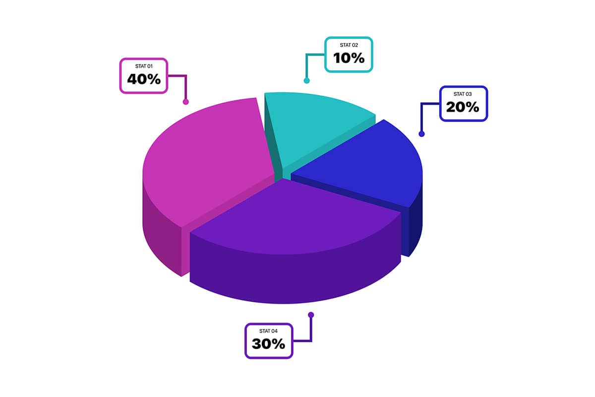
Types of Pie Charts
- Simple Pie Chart: A standard circular chart where slices represent different categories.
- Exploded Pie Chart: Highlights one or more slices by pulling them slightly away from the center.
- 3D Pie Chart: Adds a three-dimensional appearance for visual effect (though often at the cost of accuracy).
- Donut Chart: A variation with a hollow center, providing space for labels or additional information.
- Nested Pie Chart (Sunburst): Displays hierarchical data by nesting additional layers within the same circle.
Definition of Use Case
Pie charts are used to visualize part-to-whole relationships within a dataset, typically focusing on proportions or percentages. They are ideal for summarizing data into easily interpretable segments.
Why Use a Pie Chart?
Pie charts are simple and intuitive, allowing audiences to quickly grasp how different parts contribute to a whole. Their clear and colorful presentation makes them ideal for non-technical audiences and quick data comparisons.
Significance in Data Analysis
Pie charts are a staple in data analysis for their ability to summarize proportional data and provide a snapshot of category contributions. They are commonly used in business reporting, marketing analysis, and educational presentations.
Structure and Components of a Pie Chart
Key Elements
- Slices: Represent categories or segments of the dataset, with each slice’s size proportional to its value.
- Labels: Provide category names and/or values, often displayed on or near slices.
- Legend: Explains the color coding or patterning used for slices.
- Center Point: The origin of the chart, often used for exploded or donut charts.
- Colors: Differentiate slices and improve visual clarity.
Usage Scenarios
When to Use a Pie Chart?
- Part-to-Whole Relationships: Displaying proportions, such as market share by company or sales by product category.
- Simple Comparisons: Showing the distribution of responses in a survey.
- Budget Breakdown: Visualizing how expenses are distributed across different departments or activities.
- Demographic Analysis: Highlighting the percentage of various age groups, genders, or regions in a population.
- Single Data Series: Representing one dataset where proportions are the primary focus.
When Not to Use a Pie Chart?
- Too Many Categories: Pie charts become cluttered and hard to interpret when there are more than 5–7 slices.
- Precise Comparisons: Bar or column charts are better for comparing exact values between categories.
- Negative or Zero Values: Pie charts cannot represent negative or zero values effectively.
- Data Trends Over Time: Line or area charts are better suited for visualizing changes over time.
- Multiple Data Series: Use stacked bar or grouped column charts for side-by-side comparisons of multiple datasets.
Interpretation Guidelines
- Read Slice Sizes: Larger slices represent higher proportions, while smaller slices indicate lesser contributions.
- Examine Labels or Legends: Ensure category names and values are clear and match the chart’s color coding.
- Focus on Key Segments: Look for the largest and smallest slices to identify dominant or minor categories.
- Check Percentages: Validate that the total of all slices equals 100% if the data is percentage-based.
- Avoid Over-Interpretation: Pie charts are for proportions; avoid trying to extract trends or precise comparisons from them.
Strengths and Weaknesses of Pie Charts
Advantages
- Easy to Understand: Simple design makes them accessible to non-technical audiences.
- Visually Appealing: Colorful slices make pie charts engaging and eye-catching.
- Summarizes Proportions: Clearly displays part-to-whole relationships.
- Ideal for Small Datasets: Works well with datasets containing a few categories.
- Flexible Variations: Variants like donut charts or exploded charts add functionality and appeal.
Limitations
- Hard to Compare Slices: Precise comparisons between slices can be challenging without labels.
- Clutter with Many Categories: Adding too many slices makes the chart difficult to read and interpret.
- Not Ideal for Trends: Cannot represent changes or trends over time effectively.
- Misleading Proportions: Differences in slice size can be exaggerated or minimized if the chart isn’t scaled properly.
- No Negative Values: Cannot represent data with negative or zero values.
Design Best Practices
- Limit Slices: Use no more than 5–7 categories to maintain clarity and readability.
- Use Clear Labels: Include category names and percentages or values directly on slices or in a legend.
- Choose Distinct Colors: Assign unique and contrasting colors to slices for better differentiation.
- Highlight Key Segments: Use exploded slices or annotations to emphasize significant categories.
- Check Proportions: Ensure the total of all slices equals 100% when dealing with percentage-based data.
Examples of Pie Charts
Simple Examples
- Market Share: Showing the percentage share of each company in a competitive market.
- Budget Allocation: Visualizing how a company’s budget is distributed across departments.
- Survey Results: Displaying the percentage of responses for different choices in a survey.
- Demographic Data: Highlighting population distribution by age group or gender.
- Product Sales: Visualizing the percentage contribution of different products to total sales.
Advanced Examples
- Financial Analysis: Visualizing revenue breakdowns by business segment or region using a nested pie chart.
- Marketing Performance: Comparing the contribution of marketing channels (social media, email, ads) to total conversions.
- Energy Consumption: Showing the proportion of energy consumption by source (solar, wind, coal, etc.).
- Customer Segmentation: Displaying customer base distribution by age, income, or geography using an exploded pie chart.
- Event Attendance: Visualizing the percentage of attendees by ticket type (VIP, regular, student, etc.).
Comparison with Similar Visualizations
Similarities
- Pie vs. Donut Chart: Both represent part-to-whole relationships, but donut charts have a hollow center, which can be used for additional labels or to reduce visual density.
- Pie vs. Exploded Pie Chart: Both focus on proportions, but exploded pie charts emphasize specific slices by pulling them outward from the center.
- Pie vs. 3D Pie Chart: Both visualize proportions, but 3D pie charts add a dimensional effect, which may enhance visual appeal but reduce accuracy.
- Pie vs. Nested Pie Chart: Both show proportional data, but nested pie charts (or sunburst charts) represent hierarchical relationships with multiple layers.
- Pie vs. Trapezoidal Pie Chart: Both are used to visualize proportions, but trapezoidal pie charts alter the shape to better reflect proportional differences.
Differences
- Pie vs. Donut Chart: Donut charts allow space in the center for text or additional data, whereas pie charts use the full circle for slices.
- Pie vs. Exploded Pie Chart: Exploded pie charts emphasize key categories by separating slices, while standard pie charts maintain a compact form.
- Pie vs. 3D Pie Chart: 3D pie charts focus on aesthetics but can distort proportions, while standard pie charts are better for precise interpretation.
- Pie vs. Nested Pie Chart: Nested pie charts allow for multiple levels of data (e.g., subcategories), whereas standard pie charts display a single level of information.
- Pie vs. Trapezoidal Pie Chart: Trapezoidal pie charts use flattened perspectives to better emphasize differences in segment proportions compared to traditional circular pie charts.