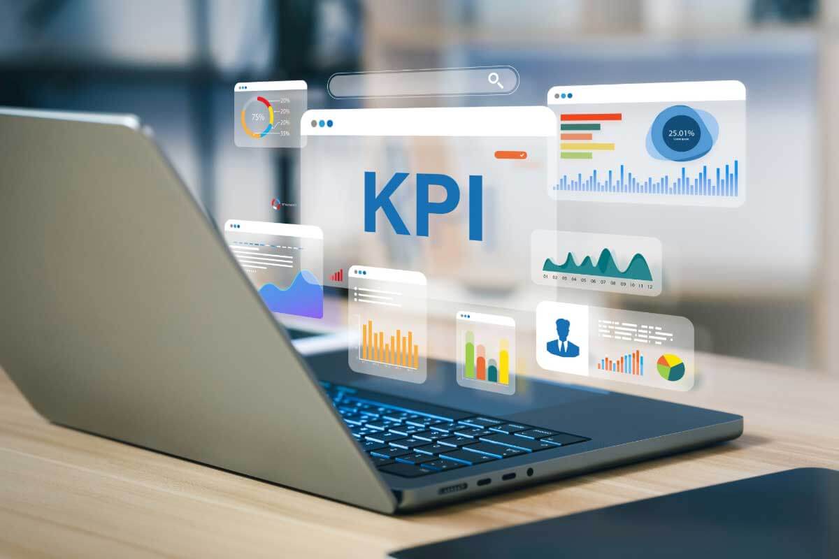
Key Performance Indicator (KPI) visualizations are data-driven metrics that highlight progress toward specific goals or objectives. Typically displayed on dashboards, KPIs provide real-time insights into performance and help organizations monitor critical business outcomes. These visualizations are designed to present complex data in a simplified, digestible format, often using minimalistic and intuitive visual cues.
General Overview of KPI Visualizations
Visualization Name: KPI Visualization
Visualization Category: Key Metrics
Types of KPI Visualizations
- Simple KPI Card: Displays a single metric with its value and status indicator (e.g., green for good performance, red for poor).
- Comparison KPI: Compares a current value to a previous period or a benchmark (e.g., this month vs. last month).
- Trend KPI: Includes a sparkline or small chart to show trends over time.
- Progress KPI: Uses progress bars or gauges to indicate how close the metric is to achieving the target.
- Interactive KPI: Allows users to drill down into detailed views or filter metrics by time, location, or category.
Definition of Use Case
KPI visualizations are used to track performance and measure progress toward specific objectives. They are especially effective in monitoring business, financial, operational, or strategic goals in real-time.
Why Use KPI Visualizations?
KPI visualizations simplify complex data into actionable insights, making them indispensable for decision-making. Their clear and concise design enables stakeholders to quickly assess performance and take corrective action if necessary.
Significance in Data Analysis
KPI visualizations provide a snapshot of critical metrics, offering clarity and focus for performance monitoring. They are essential for aligning team efforts, prioritizing initiatives, and driving results toward strategic goals.
Structure and Components of KPI Visualizations
Key Elements
- Metric Value: The primary value displayed, representing the key measurement (e.g., revenue, conversion rate, or customer satisfaction).
- Comparison Indicator: Shows changes relative to a benchmark or previous period (e.g., percentage increase or decrease).
- Status Indicator: Uses color (e.g., green, yellow, red) or icons (e.g., arrows, symbols) to represent the performance status.
- Target Value: Indicates the goal or expected performance level for the metric.
- Additional Context (Optional): Includes supporting information, such as time periods, trends, or data breakdowns.
Usage Scenarios
When to Use KPI Visualizations?
- Business Dashboards: Monitoring metrics like revenue, customer churn, or sales performance in real-time.
- Project Management: Tracking milestones, budget usage, and progress toward project goals.
- Marketing Campaigns: Measuring key metrics like click-through rates, conversions, or ad performance.
- Operational Efficiency: Visualizing metrics such as production output, equipment utilization, or delivery times.
- Customer Experience: Monitoring customer satisfaction scores, Net Promoter Scores (NPS), or response times.
When Not to Use KPI Visualizations?
- Detailed Analysis: Use tables or detailed reports for in-depth breakdowns instead of summary metrics.
- Trend Visualization Only: Use line charts or area charts for purely trend-based analyses over time.
- Complex Relationships: Use scatter plots or heatmaps to analyze correlations or relationships between variables.
- Hierarchical Data: Treemaps or sunburst charts are better for datasets with multiple levels of hierarchy.
- Static Reports: KPI visualizations are designed for real-time or dynamic monitoring, making them less useful for static summaries.
Interpretation Guidelines
- Understand the Metric: Ensure clarity on what the metric represents and its relevance to objectives.
- Compare Against Benchmarks: Assess performance relative to targets, benchmarks, or previous periods.
- Focus on Status Indicators: Use color codes or symbols to quickly gauge whether the metric is on track or requires attention.
- Analyze Trends: Examine included sparklines or trend indicators to identify upward or downward movements.
- Consider Context: Use additional information, such as time periods or comparisons, to interpret the data accurately.
Strengths and Weaknesses of KPI Visualizations
Advantages
- Real-Time Insights: Provides up-to-date performance tracking, enabling timely decision-making.
- Clear and Concise: Simplifies complex data into easy-to-understand metrics for stakeholders.
- Actionable: Focuses on key metrics that directly impact goals and objectives.
- Customizable: Allows for tailored designs, such as color schemes, thresholds, and interactivity.
- Efficient Space Usage: Compact design fits well on dashboards alongside other visualizations.
Limitations
- Lack of Depth: Does not provide detailed insights or breakdowns for complex datasets.
- Limited Comparisons: Focuses on one or a few metrics, making it unsuitable for multi-variable analysis.
- Overemphasis on Targets: May lead to a narrow focus on hitting specific goals without understanding broader implications.
- Static Context: Non-interactive KPI cards may fail to provide deeper context or drill-down options.
- Dependence on Data Accuracy: Relies on real-time, accurate data for meaningful insights; errors can mislead decision-making.
Design Best Practices
- Highlight Key Metrics: Ensure the primary metric value is prominent and easy to read.
- Use Color Effectively: Apply intuitive color schemes (e.g., green for good, red for poor) to indicate status clearly.
- Provide Context: Include comparisons to targets, benchmarks, or previous periods for added clarity.
- Focus on Simplicity: Avoid overcrowding the visualization with excessive details or secondary metrics.
- Incorporate Interactivity: Enable drill-downs or hover features to explore the data behind the KPI if needed.
Examples of KPI Visualizations
Simple Examples
- Sales Revenue: Displaying current monthly revenue with a percentage change from the previous month.
- Customer Satisfaction: Showing a Net Promoter Score (NPS) with a color-coded status indicator.
- Website Performance: Tracking the number of daily visitors and their average session duration.
- Marketing Campaigns: Displaying click-through rates and conversion percentages in a campaign dashboard.
- Budget Tracking: Showing current spending vs. budget allocation with a progress bar.
Advanced Examples
- Financial KPIs: Displaying revenue, gross profit, and EBITDA on a multi-metric dashboard with sparklines for trends.
- Customer Retention: Visualizing churn rates alongside new customer acquisition metrics for the quarter.
- Supply Chain Efficiency: Monitoring delivery times, inventory levels, and shipment accuracy with comparison indicators.
- Employee Performance: Displaying key metrics such as completed tasks, project timelines, and efficiency scores for teams.
- Environmental Impact: Tracking CO2 emissions, waste reductions, and energy consumption in sustainability initiatives.
Comparison with Similar Visualizations
Similarities
- KPI vs. Gauge Chart: Both track performance metrics, but KPI cards are more compact, while gauge charts focus on progress toward a goal.
- KPI vs. Progress Bar: Both show progress, though KPI cards often provide additional context like comparisons or trends.
- KPI vs. Line Chart: Both can include trends, but KPI cards are more focused on summary metrics than detailed time-series analysis.
- KPI vs. Heatmap: Both provide at-a-glance insights, though heatmaps focus on patterns across multiple variables, while KPIs emphasize single metrics.
- KPI vs. Dashboard: KPI cards are components of dashboards, summarizing individual metrics within broader analyses.
Differences
- KPI vs. Gauge Chart: Gauge charts use a visual dial to show progress, while KPI cards focus on numeric or percentage values.
- KPI vs. Progress Bar: Progress bars emphasize completion status, while KPI cards highlight values and comparisons.
- KPI vs. Line Chart: Line charts are better for detailed trend analysis, while KPI cards summarize current performance.
- KPI vs. Heatmap: Heatmaps visualize relationships in grids, while KPI cards focus on single metrics and their statuses.
- KPI vs. Dashboard: Dashboards aggregate multiple KPIs and other visualizations to provide a comprehensive overview.
Conclusion
KPI visualizations are a cornerstone of performance tracking and decision-making. Their simplicity, clarity, and focus make them an essential tool for monitoring critical metrics in real-time. When designed effectively, KPI cards can distill complex datasets into actionable insights, driving better decisions and aligning teams with organizational objectives.