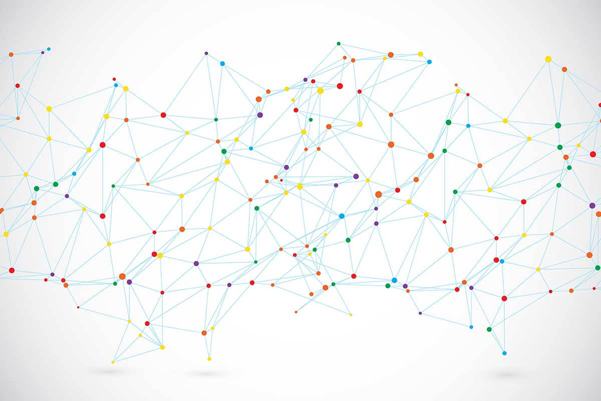
A network map, also known as a network graph, is a data visualization used to represent relationships, connections, or interactions between entities, often referred to as nodes. The connections between nodes, called edges, show how entities relate to each other. Network maps are widely used in social network analysis, computer network monitoring, and systems mapping to provide an intuitive overview of complex relationships.
General Overview of Network Maps
Visualization Name: Network Map
Visualization Category: Geospatial
Types of Network Maps
- Force-Directed Network Map: Positions nodes using algorithms that simulate physical forces to create an intuitive layout.
- Hierarchical Network Map: Organizes nodes in a structured hierarchy, such as tree-like arrangements.
- Clustered Network Map: Groups nodes into clusters based on their relationships or shared attributes.
- Interactive Network Map: Enables users to zoom, pan, or click on nodes and edges to explore additional details.
- Weighted Network Map: Represents the strength of connections using the thickness or color intensity of edges.
Definition of Use Case
Network maps are used to visualize and analyze the relationships or interactions between entities in a dataset. They are particularly effective for understanding the structure, dynamics, and central points of complex networks.
Why Use a Network Map?
Network maps provide a visually compelling and intuitive way to understand connections between entities. They are essential for exploring relationships, identifying patterns, and uncovering key influencers in a system.
Significance in Data Analysis
Network maps help analysts understand the structure of relationships, detect clusters, and uncover influential nodes or connections. They are valuable for exploratory analysis and communication of complex relational data.
Structure and Components of a Network Map
Key Elements
- Nodes: Represent entities, such as people, devices, or concepts, often depicted as circles.
- Edges: Represent connections or relationships between nodes, often depicted as lines.
- Node Size: Indicates the importance, weight, or magnitude of an entity, such as its degree of connectivity.
- Edge Weight: Represents the strength or type of connection, often visualized through thickness or color intensity.
- Labels: Provide context for nodes and edges, such as names, IDs, or attributes.
- Color Coding: Differentiates clusters, groups, or types of nodes for better clarity.
Usage Scenarios
When to Use a Network Map?
- Social Network Analysis: Visualizing relationships between individuals, such as friendships, collaborations, or communication patterns.
- IT Network Monitoring: Mapping connections between devices, servers, or nodes in a computer network.
- Ecosystem Mapping: Representing relationships between species, environments, or resources in ecological studies.
- Knowledge Graphs: Displaying links between concepts, topics, or pieces of information for research or knowledge management.
- Supply Chain Analysis: Tracking relationships and dependencies between suppliers, manufacturers, and distributors.
When Not to Use a Network Map?
- Linear Relationships: Use line or bar charts for simple cause-and-effect relationships or comparisons.
- Quantitative Comparisons: Bar or column charts are better for comparing exact values across categories.
- Time-Series Data: Use line charts or area charts to track changes over time.
- Small Datasets: For a small number of entities or relationships, tables or simple diagrams may suffice.
- Static Data: For datasets without complex relationships, use simpler charts like pie charts or scatter plots.
Interpretation Guidelines
- Understand Node Labels: Start by identifying what each node represents, such as people, devices, or concepts.
- Analyze Edges: Observe connections between nodes to understand relationships, such as direct links or clusters.
- Focus on Node Size: Larger nodes often indicate greater importance, such as higher connectivity or influence.
- Identify Clusters: Look for groups of tightly connected nodes that may indicate sub-networks or communities.
- Use Colors and Weights: Refer to color coding and edge thickness to analyze relationships or groupings effectively.
Strengths and Weaknesses of Network Maps
Advantages
- Visualizes Complex Relationships: Provides a clear overview of connections, patterns, and interactions in complex systems.
- Reveals Clusters: Highlights groupings, communities, or tightly connected entities within the network.
- Dynamic Exploration: Interactive features allow users to zoom, pan, or filter data for deeper insights.
- Customizable: Supports adjustments like node size, edge weight, and color coding for tailored analysis.
- Applicable Across Fields: Useful in various domains, including social networks, biology, IT, and business.
Limitations
- Visual Clutter: Dense networks with many nodes and edges can become overwhelming or unreadable.
- Scalability Issues: Large networks may require sampling, filtering, or aggregation for effective visualization.
- Interpretation Complexity: Requires familiarity with network analysis concepts for effective use.
- Data Dependency: Relies on accurate and complete relationship data to provide meaningful insights.
- Static Limitations: Non-interactive network maps may fail to convey detailed insights effectively.
Design Best Practices
- Simplify Large Networks: Filter or aggregate nodes and edges to reduce visual clutter and enhance readability.
- Use Color Coding: Differentiate groups or clusters with distinct colors to highlight patterns or communities.
- Adjust Node Size: Scale nodes according to importance, degree of connectivity, or other relevant metrics.
- Incorporate Interactivity: Add features like zoom, pan, and tooltips for exploring large or complex networks dynamically.
- Provide Context: Include legends, labels, or annotations to help viewers understand the network’s structure and meaning.
Examples of Network Maps
Simple Examples
- Social Media Connections: Visualizing friendships or follower relationships on platforms like Facebook or Twitter.
- Team Collaboration: Mapping communication patterns within a team or organization.
- IT Network Diagram: Representing connections between servers, routers, and devices in a computer network.
- Supply Chain Relationships: Showing links between suppliers, manufacturers, and distributors.
- Topic Relationships: Displaying relationships between keywords or topics in a document or database.
Advanced Examples
- Biological Networks: Mapping protein-protein interactions or genetic relationships in biological systems.
- Fraud Detection: Analyzing financial transaction networks to detect suspicious patterns or clusters.
- Epidemiology Studies: Tracking the spread of diseases through social or geographical networks.
- Customer Journey Mapping: Visualizing touchpoints and interactions across a customer’s journey with a brand.
- Transportation Networks: Representing routes, stations, and traffic patterns in public transportation systems.
Comparison with Similar Visualizations
Similarities
- Network Map vs. Tree Diagram: Both represent relationships, though tree diagrams are hierarchical, while network maps are non-linear.
- Network Map vs. Flowchart: Both visualize connections, though flowcharts focus on process flows rather than relational networks.
- Network Map vs. Scatter Plot: Both position entities in a plane, but scatter plots do not show relationships between points.
- Network Map vs. Heatmap: Both can highlight patterns, though heatmaps aggregate data in a grid format.
- Network Map vs. Matrix Chart: Both can display relationships, but matrix charts use a tabular structure instead of a graph.
Differences
- Network Map vs. Tree Diagram: Tree diagrams are strictly hierarchical, while network maps allow for more complex, interlinked relationships.
- Network Map vs. Flowchart: Flowcharts show processes and decision points, while network maps focus on connections between entities.
- Network Map vs. Scatter Plot: Scatter plots focus on distributions of variables, while network maps emphasize connections.
- Network Map vs. Heatmap: Heatmaps visualize aggregated data intensity, while network maps focus on individual relationships.
- Network Map vs. Matrix Chart: Matrix charts display relationships in a tabular format, while network maps provide a more dynamic, spatial representation.
Conclusion
Network maps are an essential tool for visualizing and analyzing relationships in complex systems. Their ability to highlight connections, clusters, and influencers makes them invaluable for fields such as social network analysis, IT infrastructure monitoring, and knowledge management. By following best practices and leveraging interactivity, network maps can unlock deeper insights into relational data while maintaining clarity and impact.