A column chart is one of the most commonly used data visualizations, representing categorical data with vertical bars. The length of each bar corresponds to the magnitude of the data it represents, making it easy to compare values across categories. Column charts are widely used in various fields, such as business, education, and research, due to their simplicity and effectiveness in conveying information.
General Overview of Column Charts
Visualization Name: Column Chart
Visualization Category: Comparison
Types of Column Charts
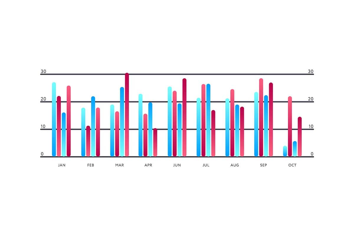
- Simple Column Chart: Displays a single series of data as vertical bars.
- Grouped Column Chart: Groups bars for each category to compare multiple subcategories side by side.
- Stacked Column Chart: Stacks subcategory values on top of each other to represent parts-to-whole relationships.
- 100% Stacked Column Chart: Normalizes stacked bars to 100% to compare proportions across categories.
- Interactive Column Chart: Includes hover or click features to provide additional details about the data.
Definition of Use Case
Column charts are used to visualize and compare numerical data across categories. They are ideal for identifying trends, making comparisons, and highlighting differences within a dataset.
Why Use a Column Chart?
Column charts are easy to create and interpret, making them highly effective for presenting data comparisons in a straightforward manner. Their vertical orientation also makes them suitable for time-series data or datasets with long category labels.
Significance in Data Analysis
Column charts help analysts identify patterns, outliers, and trends in categorical data. They are an essential tool for exploratory analysis and communicating insights in presentations or reports.
Structure and Components of Column Charts
Key Elements
- Bars: Represent data points, with their height proportional to the value they represent.
- X-Axis: Displays the categories or groups being compared.
- Y-Axis: Represents the scale of the values, often numerical or percentage-based.
- Labels: Provide context for the bars, axes, or categories to make the chart easier to interpret.
- Colors: Differentiate categories, subcategories, or highlight specific data points.
Usage Scenarios
When to Use a Column Chart?
- Category Comparisons: Comparing values across distinct categories, such as sales by region or product type.
- Time-Based Trends: Tracking changes over time, especially when time periods are evenly spaced (e.g., months or years).
- Subcategory Analysis: Using grouped or stacked column charts to analyze subcategories within main categories.
- Highlighting Outliers: Emphasizing significant differences or variances between data points.
- Proportional Analysis: Using stacked or 100% stacked column charts to represent parts-to-whole relationships.
When Not to Use a Column Chart?
- Continuous Data: Line charts or scatter plots are better for visualizing continuous data trends or relationships.
- Large Numbers of Categories: Too many categories can clutter the chart; consider simplifying or using a horizontal bar chart.
- Hierarchical Data: Treemaps or sunburst charts are more effective for hierarchical relationships.
- Exact Numerical Analysis: Tables are better for analyzing or comparing precise values.
- Overlapping Data: Stacked column charts may obscure comparisons between individual subcategories; grouped column charts or other visualizations are better suited for this purpose.
Interpretation Guidelines
- Understand the Axes: Identify the categories on the X-axis and the value scale on the Y-axis to provide context for the data.
- Compare Bar Heights: Use the height of the bars to analyze differences between categories or subcategories.
- Look for Patterns: Observe trends, clusters, or outliers in the data to draw meaningful insights.
- Analyze Colors: Refer to the legend to understand the meaning of colors, especially in grouped or stacked charts.
- Focus on the Scale: Pay attention to the Y-axis scale to interpret values accurately and avoid misleading conclusions.
Strengths and Weaknesses of Column Charts
Advantages
- Simple and Intuitive: Easy to understand for both technical and non-technical audiences.
- Versatile: Adapts to various contexts, such as comparisons, trends, and proportions.
- Customizable: Supports enhancements like grouping, stacking, and color coding for deeper analysis.
- Highlight Differences: Effectively showcases variances between categories or groups.
- Widely Recognized: Familiar format that requires little explanation for most viewers.
Limitations
- Cluttered with Many Categories: Too many bars can make the chart difficult to read and interpret.
- Oversimplifies Relationships: Does not reveal relationships between variables or handle multidimensional data well.
- Space Constraints: Vertical orientation can be limiting for datasets with long category labels or many groups.
- Static Representation: Non-interactive column charts may lack the depth needed for exploring complex datasets.
- Not Suitable for Dense Data: Large datasets with overlapping information can be better represented with scatter plots or heatmaps.
Design Best Practices
- Limit Categories: Keep the number of bars manageable to ensure the chart remains readable.
- Use Distinct Colors: Apply a consistent and clear color scheme to differentiate categories or subcategories.
- Label Clearly: Provide concise labels for axes, bars, and legends to guide viewers effectively.
- Order Categories Intuitively: Arrange categories logically, such as alphabetically, by value, or chronologically.
- Avoid 3D Effects: Stick to flat designs for better accuracy and readability, as 3D effects can distort perceptions of bar heights.
Examples of Column Charts
Simple Examples
- Sales Analysis: Comparing monthly sales figures for a single product or product line.
- Survey Responses: Displaying customer satisfaction levels across different demographics.
- Performance Metrics: Visualizing employee performance scores by department.
- Population Distribution: Showing the age group distribution in a population across regions.
- Event Attendance: Highlighting attendance numbers across various events or sessions.
Advanced Examples
- Financial Analysis: Comparing revenue, expenses, and profits across multiple business units over time.
- Marketing Campaign Results: Displaying click-through rates and conversion rates for multiple campaigns across platforms.
- Energy Consumption: Showing monthly energy usage across different facilities or equipment types.
- Healthcare Metrics: Comparing patient recovery rates across hospitals and treatment types.
- Academic Performance: Analyzing exam scores across subjects and grade levels over several years.
Comparison with Similar Visualizations
Similarities
- Column Chart vs. Bar Chart: Both represent data using bars, with column charts oriented vertically and bar charts horizontally.
- Column Chart vs. Stacked Column Chart: Both use vertical bars, but stacked column charts emphasize parts-to-whole relationships.
- Column Chart vs. Line Chart: Both can show trends, though line charts are better for continuous data.
- Column Chart vs. Heatmap: Both compare values across categories, though heatmaps use color intensity in grids.
- Column Chart vs. Pie Chart: Both visualize proportions, but column charts handle larger datasets more effectively.
Differences
- Column Chart vs. Bar Chart: Column charts are better for time-based data, while bar charts are ideal for datasets with long category labels.
- Column Chart vs. Stacked Column Chart: Stacked column charts display cumulative data, while simple column charts highlight individual values.
- Column Chart vs. Line Chart: Line charts are better for analyzing trends over time, while column charts focus on discrete comparisons.
- Column Chart vs. Heatmap: Heatmaps are more suitable for dense datasets, while column charts excel at simpler comparisons.
- Column Chart vs. Pie Chart: Pie charts emphasize proportions within a single category, while column charts allow for multi-category comparisons.
Conclusion
Column charts are a foundational tool in data visualization, offering a straightforward and effective way to compare data across categories. Their simplicity, versatility, and clarity make them suitable for a wide range of applications, from business analytics to educational reports. By adhering to design best practices and tailoring the chart to the dataset, column charts can effectively communicate insights and drive informed decision-making.