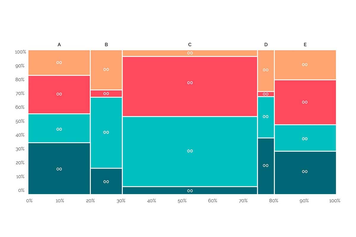
A Mekko chart, also known as a Marimekko chart, is a two-dimensional visualization that combines features of bar charts and stacked bar charts, with the additional ability to vary the width of the bars. Each bar’s height and width represent two different variables, while segments within the bars show subcategories. Mekko charts are particularly useful for visualizing market shares, competitive analysis, or any scenario where both proportions and absolute values need to be represented.
General Overview of Mekko Charts
Visualization Name: Mekko Chart (Marimekko Chart)
Visualization Category: Comparison
Types of Mekko Charts
- Standard Mekko Chart: Displays bars with varying widths and heights to represent two variables simultaneously.
- 100% Mekko Chart: Normalizes the height of all bars to 100%, focusing exclusively on proportions across subcategories.
- Stacked Mekko Chart: Similar to a stacked bar chart, but with varying bar widths to encode additional data.
- Interactive Mekko Chart: Includes hover or click features to reveal additional details about categories or subcategories.
Definition of Use Case
Mekko charts are used to represent data with two numerical dimensions, where one variable controls the width of the bars and the other controls the height. They are ideal for visualizing market shares, resource allocation, or competitive landscapes.
Why Use a Mekko Chart?
Mekko charts provide a compact and visually impactful way to represent relationships between two variables while highlighting proportions within categories. They are ideal for analyzing data hierarchies and distribution patterns in a single visualization.
Significance in Data Analysis
Mekko charts help analysts explore multidimensional datasets, identify dominant categories or subcategories, and assess relative contributions in a visually intuitive manner. They are particularly valuable for summarizing large datasets in strategic contexts like business or marketing.
Structure and Components of Mekko Charts
Key Elements
- Bars: Represent categories, with their width encoding one variable and height encoding another.
- Segments: Subdivisions within bars that represent subcategories or proportions.
- X-Axis: Displays the categories or groups, with their widths proportional to a variable.
- Y-Axis: Represents the scale for the variable encoded by the height of the bars.
- Colors: Distinguish subcategories or segments within bars for better clarity.
- Legend: Identifies the subcategories represented by colors within the chart.
Usage Scenarios
When to Use a Mekko Chart?
- Market Share Analysis: Comparing market share percentages across industries or regions while showing absolute size.
- Competitive Landscape: Visualizing competitors’ contributions to market segments based on revenue and customer base.
- Resource Allocation: Analyzing budget distribution across departments and their contributions to overall spending.
- Portfolio Analysis: Displaying product performance based on revenue and profit contribution within categories.
- Customer Segmentation: Mapping customer segments by demographic size and spending behavior.
When Not to Use a Mekko Chart?
- Simple Comparisons: Use bar or column charts for straightforward comparisons between a single variable.
- Continuous Data: Line charts or scatter plots are more appropriate for time-series data or trends.
- Exact Numerical Analysis: Tables are better for examining precise values or small datasets.
- Overlapping Data Points: Use scatter plots or bubble charts if data points overlap significantly.
- Complex Datasets: Large or highly detailed datasets may require interactive dashboards or alternative visualizations like treemaps.
Interpretation Guidelines
- Understand Bar Widths: Start by identifying the variable represented by the width of the bars along the X-axis.
- Analyze Bar Heights: Observe the height of each bar to understand the second variable’s distribution across categories.
- Examine Segments: Look at the subcategories within each bar and their relative contributions to the total.
- Use Color Coding: Refer to the legend to distinguish between subcategories or groups within the chart.
- Focus on Proportions: Evaluate the relative sizes of segments and bars to understand the distribution patterns clearly.
Strengths and Weaknesses of Mekko Charts
Advantages
- Compact Visualization: Combines two dimensions of data into one chart, saving space while conveying detailed insights.
- Highlights Proportions: Clearly shows the relative sizes of categories and subcategories within the dataset.
- Supports Multivariable Analysis: Encodes two variables (width and height) along with subcategories in a single chart.
- Visually Impactful: Provides a clear overview of data distribution, making it ideal for presentations and strategic discussions.
- Customizable: Allows for variations such as normalization or interactivity to suit specific needs.
Limitations
- Complex for Beginners: May require explanation for viewers unfamiliar with Mekko charts or their components.
- Limited Scalability: Becomes cluttered and hard to interpret with a large number of categories or subcategories.
- Overemphasizes Larger Categories: Larger bars may visually dominate the chart, even if their height is smaller.
- Static Representation: Without interactivity, detailed exploration of subcategories can be challenging.
- Data Dependency: Relies on normalized or well-structured data for accurate representation.
Design Best Practices
- Limit Categories: Use a manageable number of bars and segments to ensure clarity and readability.
- Use Distinct Colors: Apply contrasting colors for subcategories to make the chart visually accessible.
- Label Clearly: Provide concise labels for axes, bars, and segments to guide interpretation effectively.
- Normalize Data (if needed): Consider using a 100% Mekko chart when proportions are more important than absolute values.
- Incorporate Interactivity: Add hover, zoom, or filtering features in digital formats to explore data dynamically.
Examples of Mekko Charts
Simple Examples
- Market Share Analysis: Comparing market shares of companies across industries with varying market sizes.
- Budget Distribution: Displaying department budgets and their contributions to the overall organizational budget.
- Product Portfolio: Visualizing product revenue and profit contributions within different categories.
- Customer Segments: Mapping customer spending patterns by demographics and region sizes.
- Advertising Metrics: Comparing ad spend across channels and their share of total campaign budgets.
Advanced Examples
- Global Market Analysis: Representing revenue and market shares for industries across different countries or regions.
- Healthcare Resource Allocation: Visualizing hospital bed allocations and patient demographics within healthcare systems.
- Competitive Positioning: Comparing competitors’ market shares and revenue contributions in a multi-industry analysis.
- Environmental Studies: Mapping resource consumption by region and its contribution to global totals.
- Retail Sales Analysis: Displaying sales revenue and profit margins for product categories across stores.
Comparison with Similar Visualizations
Similarities
- Mekko Chart vs. Stacked Bar Chart: Both represent subcategories within categories, though Mekko charts vary bar widths.
- Mekko Chart vs. Treemap: Both display hierarchical data and proportions, but Mekko charts use bars instead of nested rectangles.
- Mekko Chart vs. 100% Stacked Chart: Both emphasize proportions, but Mekko charts encode a second variable via bar widths.
- Mekko Chart vs. Pie Chart: Both show parts-to-whole relationships, though Mekko charts provide more detail with subcategories.
- Mekko Chart vs. Heatmap: Both visualize data distributions, but Mekko charts are bar-based and encode an additional variable.
Differences
- Mekko Chart vs. Stacked Bar Chart: Stacked bar charts have uniform widths, while Mekko charts vary bar widths to encode a second variable.
- Mekko Chart vs. Treemap: Treemaps use nested rectangles, while Mekko charts use bars to represent categories.
- Mekko Chart vs. 100% Stacked Chart: 100% stacked charts normalize all bars to the same height, while Mekko charts can represent absolute values.
- Mekko Chart vs. Pie Chart: Pie charts are circular and focus on single parts-to-whole relationships, while Mekko charts handle more complex datasets.
- Mekko Chart vs. Heatmap: Heatmaps use grid cells to show intensity, while Mekko charts combine bar heights and widths for multidimensional analysis.
Conclusion
Mekko charts are a powerful tool for visualizing multidimensional datasets where both absolute values and proportions matter. They are ideal for market analysis, resource allocation, and competitive landscapes, providing clear insights into hierarchical relationships and distributions. By following best practices and keeping the design focused, Mekko charts can effectively convey complex data in a visually engaging format.