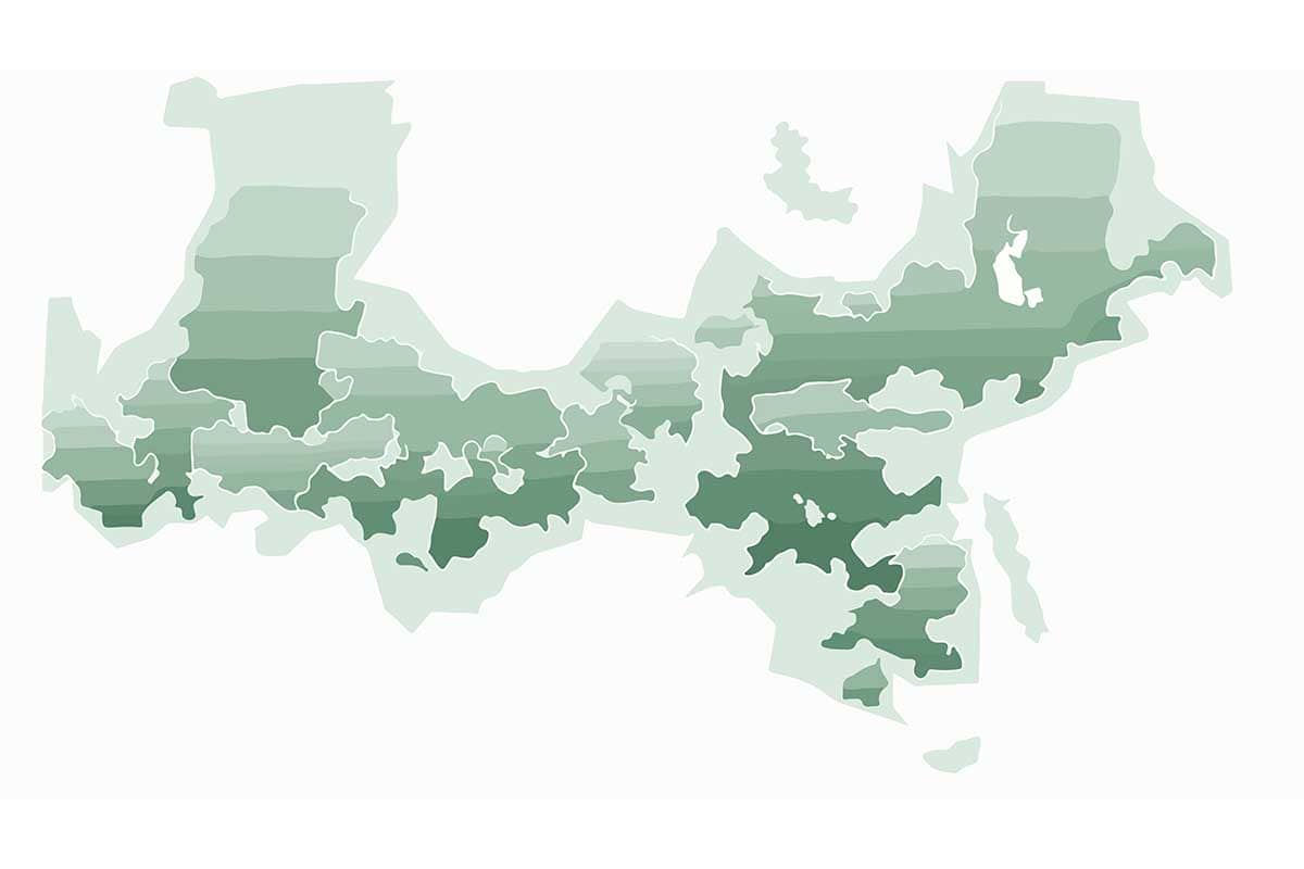
A choropleth map is a data visualization technique that uses color gradients or patterns to represent statistical data for specific geographical regions, such as countries, states, or districts. The intensity of the color corresponds to the magnitude of the data being represented, making it easy to identify spatial patterns, trends, or outliers across regions. Choropleth maps are widely used in demographics, economics, public health, and environmental studies.
General Overview of Choropleth Maps
Visualization Name: Choropleth Map
Visualization Category: Geospatial
Types of Choropleth Maps
- Single-Variable Choropleth Map: Represents a single variable, such as population density or GDP per capita, across regions.
- Bivariate Choropleth Map: Displays two related variables using combinations of colors or patterns to show their correlation.
- Proportional Choropleth Map: Scales color intensity or opacity relative to the size of the region being analyzed.
- Normalized Choropleth Map: Represents data as percentages or rates (e.g., cases per 100,000 people) to ensure fair comparisons between regions.
- Interactive Choropleth Map: Enables users to hover, zoom, or click on regions to explore additional details dynamically.
Definition of Use Case
Choropleth maps are used to represent and analyze spatial data, highlighting variations in a variable across geographic regions. They are ideal for comparing regions, identifying trends, and exploring patterns.
Why Use a Choropleth Map?
Choropleth maps provide an intuitive way to communicate geographical data, allowing viewers to quickly identify spatial patterns and make informed decisions. They are particularly effective for exploring and presenting location-based statistics.
Significance in Data Analysis
Choropleth maps play a crucial role in spatial analysis by enabling analysts to identify regional disparities, correlations, and trends. They are essential for decision-making in fields like policy planning, market analysis, and public health.
Structure and Components of a Choropleth Map
Key Elements
- Regions: Geographic areas such as countries, states, districts, or neighborhoods, which serve as the basis for data representation.
- Color Scale: A gradient or range of colors that corresponds to the data values, indicating magnitude or intensity.
- Legend: Explains the color scale and the data values it represents, providing context for interpretation.
- Base Map: Provides the geographical outline of the regions being analyzed.
- Annotations: Optional labels or tooltips that display detailed data for specific regions upon interaction.
Usage Scenarios
When to Use a Choropleth Map?
- Population Analysis: Displaying population density or distribution across regions.
- Public Health Tracking: Mapping disease prevalence or vaccination rates across districts or countries.
- Economic Data Visualization: Showing GDP per capita, income levels, or unemployment rates by region.
- Environmental Studies: Representing data like pollution levels, deforestation rates, or climate conditions geographically.
- Election Results: Visualizing voter turnout, winning parties, or demographic voting patterns across constituencies.
When Not to Use a Choropleth Map?
- Non-Geographical Data: Use bar or line charts for datasets unrelated to location.
- Small or Sparse Regions: Regions with low populations or small sizes may skew interpretation; use dot maps instead.
- Precise Comparisons: Tables or scatter plots may be better for comparing exact numerical values across regions.
- Dynamic Data: Real-time or constantly changing data may require dashboards with time-series visualizations.
- Complex Relationships: Use heatmaps or network graphs to analyze intricate correlations between multiple variables.
Interpretation Guidelines
- Examine the Legend: Begin by understanding the color scale and the range of values it represents.
- Identify Patterns: Look for areas of high or low intensity to spot trends, clusters, or outliers.
- Consider Region Sizes: Larger regions may visually dominate the map, even if their data values are not as significant.
- Normalize Data: Ensure the data is normalized (e.g., per capita) to avoid misinterpretation due to region size disparities.
- Use Interactivity (if available): Hover or click on regions to explore detailed data or additional context.
Strengths and Weaknesses of Choropleth Maps
Advantages
- Intuitive Design: Easy to interpret for audiences with varying levels of expertise.
- Pattern Recognition: Highlights spatial patterns, trends, and disparities effectively.
- Scalable: Suitable for datasets ranging from global to neighborhood-level granularity.
- Customizable: Can incorporate interactive features, multiple color scales, and annotations for deeper insights.
- Versatile: Applicable in diverse fields, from healthcare to marketing and urban planning.
Limitations
- Overemphasis on Large Areas: Larger regions may appear more significant due to their size, even if their data values are lower.
- Normalization Issues: Data must be normalized to avoid misleading interpretations (e.g., total population vs. population density).
- Limited Detail: Choropleth maps are less effective for showing fine-grained data within regions.
- Static Representation: Without interactivity, detailed exploration of specific regions can be challenging.
- Color Misinterpretation: Viewers may misinterpret subtle color gradients, particularly without a clear legend.
Design Best Practices
- Normalize Data: Use rates, percentages, or other normalized metrics to ensure fair comparisons between regions.
- Choose an Appropriate Color Scale: Use gradients that are intuitive and colorblind-friendly for accessibility.
- Provide a Clear Legend: Include a detailed legend explaining the color scale and corresponding data values.
- Avoid Overcrowding: Keep the map clean and uncluttered by limiting the number of categories or annotations.
- Incorporate Interactivity: Add hover, zoom, or click features to provide additional details and enhance usability.
Examples of Choropleth Maps
Simple Examples
- Population Density: Mapping the number of people per square kilometer across states or countries.
- Unemployment Rates: Visualizing joblessness rates across counties or regions.
- COVID-19 Cases: Representing infection rates or vaccination percentages by district or state.
- Educational Attainment: Displaying the percentage of high school graduates across regions.
- Election Results: Showing winning parties or voter turnout by state or district.
Advanced Examples
- Climate Change Impact: Visualizing changes in average temperatures or precipitation levels over decades across regions.
- Economic Indicators: Mapping GDP per capita, median income, or poverty rates across countries globally.
- Health Disparities: Representing mortality rates or access to healthcare services across urban and rural areas.
- Energy Consumption: Comparing energy usage or renewable energy adoption rates by country or region.
- Urban Development: Showing land use, housing density, or infrastructure coverage in metropolitan areas.
Comparison with Similar Visualizations
Similarities
- Choropleth Map vs. Heatmap: Both use color intensity to represent data, though heatmaps focus on grid-based data rather than geographic regions.
- Choropleth Map vs. Dot Map: Both visualize geographic data, though dot maps use points to represent occurrences or density.
- Choropleth Map vs. Bubble Map: Both represent data geographically, though bubble maps use circles sized by magnitude instead of color intensity.
- Choropleth Map vs. Filled Map: Both shade areas by data values, though filled maps may include additional interactive or descriptive features.
- Choropleth Map vs. Grid Map: Both show geographic data, though grid maps use uniform grid cells instead of actual geographic boundaries.
Differences
- Choropleth Map vs. Heatmap: Heatmaps do not use geographic boundaries, while choropleth maps are tied to specific regions.
- Choropleth Map vs. Dot Map: Dot maps represent occurrences, while choropleth maps show aggregated data by region.
- Choropleth Map vs. Bubble Map: Bubble maps emphasize magnitude with bubble sizes, while choropleth maps use color intensity.
- Choropleth Map vs. Filled Map: Filled maps are often more detailed and interactive, while choropleth maps emphasize static visual patterns.
- Choropleth Map vs. Grid Map: Grid maps divide space into equal cells, while choropleth maps use actual administrative boundaries.
Conclusion
Choropleth maps are a powerful and intuitive tool for visualizing geographical data. By leveraging color gradients to represent data intensity, they make it easy to identify spatial patterns, disparities, and trends. When designed carefully with normalized data, clear legends, and interactive features, choropleth maps can effectively communicate insights across various industries, including public health, economics, and environmental studies.