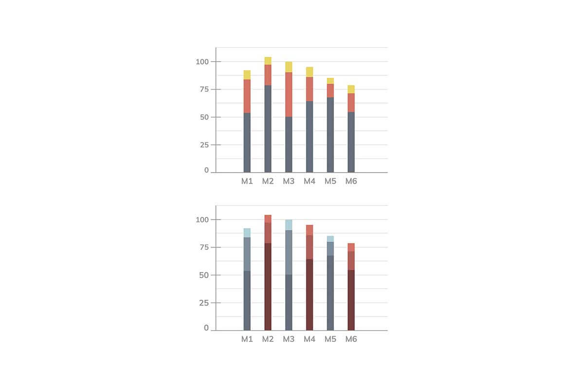
Clustered bar charts, also known as grouped bar charts, are an extension of the standard bar chart that allow comparisons of multiple data series within the same category. In this chart, bars for each subcategory are displayed side-by-side, grouped by the main category. This visualization is particularly useful for examining relationships and differences across multiple variables while keeping the comparison clear and organized.
General Overview of Clustered Bar Charts
Visualization Name: Clustered Bar Chart
Visualization Category: Comparison
Types of Clustered Bar Charts
- Vertical Clustered Bar Chart: Bars are grouped and extend vertically, ideal for scenarios with limited horizontal space.
- Horizontal Clustered Bar Chart: Bars are grouped and extend horizontally, useful when category labels are lengthy or for better readability.
Definition of Use Case
Clustered bar charts are used to compare multiple variables within the same category. They are particularly effective for comparing data across subcategories or exploring patterns and variations among groups.
Why Use a Clustered Bar Chart?
Clustered bar charts provide a detailed visual representation of multiple datasets within the same category, enabling clear and immediate comparisons. They offer an intuitive layout that allows for spotting trends and relationships while maintaining simplicity.
Significance in Data Analysis
Clustered bar charts are invaluable in data analysis when analyzing segmented data or comparing metrics across groups. They are widely applied in industries such as marketing, education, and healthcare to compare performance, demographics, and other segmented data.
Structure and Components of a Clustered Bar Chart
Key Elements
- X-Axis (Categories): Represents the main categories being compared.
- Subcategories: Groups within the main category, each represented by a separate bar in the cluster.
- Y-Axis (Values): Indicates the numerical values corresponding to the categories and subcategories.
- Bars: Rectangular shapes grouped by category, where each bar represents a subcategory.
- Colors: Differentiate between subcategories, enhancing visual clarity.
- Legend: Explains the color coding of the subcategories.
Usage Scenarios
When to Use a Clustered Bar Chart?
- Performance Comparison: Comparing sales revenue across regions and product categories.
- Demographic Insights: Analyzing age-group preferences across different locations.
- Market Trends: Displaying year-on-year growth rates for various brands within a market.
- Survey Data: Highlighting responses segmented by gender or age group.
- Education Metrics: Comparing test scores of different schools within districts.
When Not to Use a Clustered Bar Chart?
- Too Many Subcategories: Crowded clusters make comparisons difficult to interpret.
- Continuous Data: Line charts are better suited for continuous datasets.
- Simple Comparisons: Standard bar charts may suffice for fewer variables.
- High Variability: Stacked bar charts might better capture part-to-whole relationships.
- Multivariate Analysis: Scatter plots or bubble charts are better for exploring multiple dimensions.
Interpretation Guidelines
- Examine Clusters: Look at the clusters to compare subcategories within each category.
- Identify Trends: Observe patterns across categories and subcategories for insights.
- Focus on Bar Length/Height: Compare the relative sizes of bars to assess differences.
- Use the Legend: Refer to the legend for clarity on subcategory representations.
- Check Axes and Scaling: Ensure consistent scaling to avoid distorted interpretations.
Strengths and Weaknesses of Clustered Bar Charts
Advantages
- Detailed Comparisons: Effectively compares multiple datasets within a single visualization.
- Easy to Interpret: Simple layout ensures insights are accessible to a wide audience.
- Customizable: Colors and labels can be tailored to improve clarity.
- Versatile: Suitable for diverse applications, from business analysis to academic studies.
- Multi-Group Representation: Allows comparisons across main categories and subcategories simultaneously.
Limitations
- Visual Clutter: Too many subcategories or clusters can overwhelm viewers.
- Space Limitations: Horizontal charts may struggle with lengthy labels, and vertical charts may require scrolling.
- Limited Scalability: Not ideal for datasets with a large number of categories or subcategories.
- Interpretation Challenges: Requires careful design to avoid misinterpretation of grouped data.
- Static Nature: Does not capture changes over time as effectively as line charts.
Design Best Practices
- Group Bars Clearly: Ensure bars within each cluster are distinct and evenly spaced.
- Use Consistent Colors: Assign consistent colors to subcategories across all clusters.
- Label Clearly: Include clear labels for axes, clusters, and subcategories.
- Limit Categories: Avoid overcrowding by limiting the number of categories or subcategories.
- Provide a Legend: Include a well-placed legend to explain color coding.
Examples of Clustered Bar Charts
Simple Examples
- Monthly Revenue: Comparing revenue for three different products across several months.
- School Performance: Test scores of boys and girls across various schools.
- Customer Segments: Number of customers by age group for different stores.
- Sales Breakdown: Comparing online and offline sales for each product category.
- Survey Preferences: Preferences for products grouped by gender.
Advanced Examples
- Regional Analysis: Yearly sales trends for multiple brands across regions.
- Employee Metrics: Productivity and satisfaction scores segmented by department and job title.
- Market Share Study: Market share data segmented by region and year.
- Healthcare Data: Comparing patient outcomes across different treatments and age groups.
- Energy Usage: Energy consumption by source (e.g., solar, wind, coal) across multiple states.
Comparison with Similar Visualizations
Similarities
- Clustered vs. Stacked Bar Charts: Both visualizations are used to compare multiple subcategories within a single category. They rely on bars as the main visual element and work well with categorical data.
- Clustered vs. Standard Bar Charts: Both represent categories using bars and are suitable for simple and clear comparisons. The clustered version adds a layer of complexity by allowing multiple subcategories to be compared within each category.
- Clustered vs. Column Charts: Both visualize grouped data, differing primarily in orientation. Clustered bar charts use a horizontal layout, while clustered column charts display bars vertically.
- Clustered vs. Line Charts: Both can analyze multiple data groups, with clustered bar charts focusing on category-based comparisons and line charts more suited for trends in continuous data.
- Clustered vs. Pie Charts: Both visualizations represent categorical data and can display proportions. Clustered bar charts are better for making detailed comparisons between multiple subcategories, while pie charts emphasize part-to-whole relationships.
Differences
- Clustered vs. Stacked Bar Charts: Stacked bar charts layer subcategories within one bar to show cumulative totals and part-to-whole relationships. Clustered bar charts separate subcategories into individual bars for side-by-side comparisons.
- Clustered vs. Standard Bar Charts: Standard bar charts are simpler and focus on single-category comparisons, whereas clustered bar charts allow for detailed exploration of grouped data within each category.
- Clustered vs. Column Charts: Orientation is the key difference: clustered bar charts are horizontal, which can handle long labels better, while clustered column charts are vertical, fitting better into narrower spaces.
- Clustered vs. Line Charts: Line charts are ideal for showing trends over time or continuous data relationships, while clustered bar charts focus on comparing discrete categories and their subgroups.
- Clustered vs. Pie Charts: Pie charts excel at visualizing proportions within a single category, while clustered bar charts compare values across multiple categories and subcategories, providing much more detailed information.
Conclusion
Clustered bar charts are a powerful tool for analyzing and comparing multiple datasets across categories. Their ability to present segmented data makes them a staple in business analysis, education, and scientific research. By following design best practices and understanding their limitations, users can leverage clustered bar charts to draw meaningful insights and communicate findings effectively.