Clustered column charts, also known as grouped column charts, are a vertical variation of clustered bar charts. They display data in vertical columns grouped by categories, with each column representing a subcategory. This visualization is ideal for comparing multiple subcategories across different categories, offering a straightforward and visually engaging way to analyze grouped data.
General Overview of Clustered Column Charts
Visualization Name: Clustered Column Chart
Visualization Category: Comparison
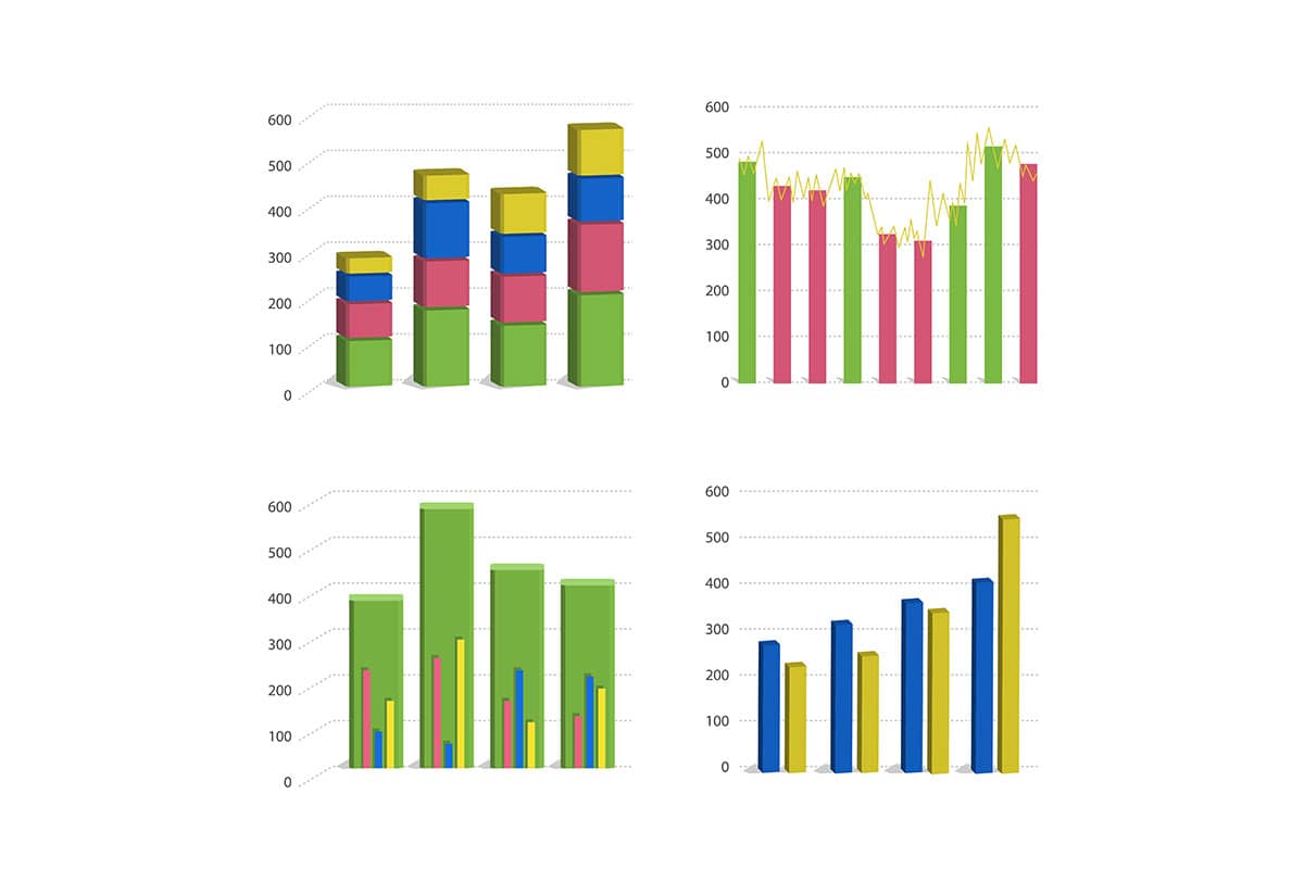
Types of Clustered Column Charts
- Simple Clustered Column Chart: Columns grouped by category with subcategories represented by individual bars in the cluster.
- 3D Clustered Column Chart: Adds a 3D visual effect for aesthetic purposes, though it may reduce clarity.
Definition of Use Case
Clustered column charts are used to compare data for multiple subcategories across a set of categories. They are particularly effective for analyzing differences, trends, and relationships among grouped data.
Why Use a Clustered Column Chart?
Clustered column charts are a go-to choice when you need to compare multiple data points within categories while maintaining clarity and readability. They are especially useful when the focus is on comparing values between subcategories rather than observing trends over time.
Significance in Data Analysis
Clustered column charts are powerful tools in data analysis for quickly identifying differences among groups, spotting trends, and analyzing segmented data. They are commonly used in business, education, healthcare, and scientific research to present comparative insights.
Structure and Components of a Clustered Column Chart
Key Elements
- X-Axis (Categories): Represents the main categories being compared.
- Subcategories: Groups within the main categories, each represented by a separate column in the cluster.
- Y-Axis (Values): Indicates the numerical values corresponding to the categories and subcategories.
- Columns: Vertical bars grouped by category, where each bar represents a subcategory.
- Colors: Differentiate between subcategories for visual clarity.
- Legend: Explains the color coding of the subcategories.
- Gridlines: Help viewers align and compare values across categories.
Usage Scenarios
When to Use a Clustered Column Chart?
- Sales Analysis: Comparing sales revenue for different product lines across several regions.
- Performance Metrics: Displaying department-wise performance across different time periods.
- Survey Results: Highlighting responses to survey questions segmented by demographic groups.
- Demographic Analysis: Comparing population distribution by age group across different countries.
- Market Insights: Analyzing market shares of various brands across different time periods.
When Not to Use a Clustered Column Chart?
- Too Many Categories: Overcrowding can reduce readability and make the chart confusing.
- Continuous Data: Line charts are better for showing continuous trends over time.
- Detailed Subcategory Comparisons: Stacked column charts might be more effective for analyzing part-to-whole relationships.
- Complex Multivariate Relationships: Scatter plots or bubble charts are more suitable for visualizing multiple variables.
- Proportion Analysis: Pie charts or 100% stacked column charts are better suited for displaying proportions.
Interpretation Guidelines
- Examine Clusters: Look at the groupings of columns to compare subcategories within each category.
- Focus on Heights: Analyze the height of the columns to understand differences in values.
- Use the Legend: Refer to the legend to identify subcategories and understand color coding.
- Compare Across Categories: Identify trends or differences in subcategory values across categories.
- Check the Axes: Ensure that the axes are labeled and scaled appropriately for accurate interpretation.
Strengths and Weaknesses of Clustered Column Charts
Advantages
- Easy Comparison: Provides a clear way to compare multiple data points within and across categories.
- Simple Layout: Straightforward design ensures ease of interpretation for a broad audience.
- Customizable: Color coding and labeling enhance clarity and focus on key insights.
- Wide Applicability: Useful across various industries for analyzing comparative data.
- Data Grouping: Displays subcategories effectively without overwhelming the chart.
Limitations
- Overcrowding: Too many columns or categories can make the chart cluttered.
- Limited Depth: Not ideal for showing relationships or trends over time.
- Scaling Challenges: Improper scaling can distort insights.
- Space Constraints: Charts with numerous clusters may require large amounts of space.
- Static Representation: Does not easily convey dynamic or continuous changes.
Design Best Practices
- Limit Subcategories: Keep the number of subcategories manageable to avoid visual clutter.
- Label Clearly: Ensure all axes, categories, and subcategories are labeled for clarity.
- Apply Consistent Colors: Use consistent color schemes across subcategories for better readability.
- Provide a Legend: Include a clear and concise legend to explain color coding and data groupings.
- Optimize Axes: Scale axes appropriately and ensure they start at zero for accurate representation.
Examples of Clustered Column Charts
Simple Examples
- Product Sales: Columns showing sales figures for different products across regions.
- Survey Data: Comparing responses from different age groups for a set of questions.
- Expense Tracking: Displaying departmental expenses across months.
- Education Metrics: Student performance in different subjects by grade level.
- Website Traffic: Comparing traffic sources (social media, search engines, etc.) by month.
Advanced Examples
- Market Research: Comparing customer preferences for product features across demographic groups.
- Operational KPIs: Tracking department-wise productivity and efficiency over quarters.
- Regional Sales Insights: Analyzing sales trends for various product lines across multiple regions.
- Health Data Analysis: Comparing disease incidence rates across different age groups and regions.
- Competitor Benchmarking: Columns showing competitor performance metrics (e.g., revenue, market share) across years.
Comparison with Similar Visualizations
Similarities
- Clustered Column vs. Clustered Bar Charts: Both group data for comparison; the difference is in orientation (vertical vs. horizontal).
- Clustered Column vs. Standard Column Charts: Both use vertical bars; clustered column charts allow for subcategory comparisons.
- Clustered Column vs. Stacked Column Charts: Both visualize grouped data, but clustered charts separate subcategories while stacked charts combine them into one bar.
- Clustered Column vs. Line Charts: Both can track multiple data groups, but clustered column charts focus on categories rather than trends.
- Clustered Column vs. Pie Charts: Both can represent categorical data, but clustered column charts are better for comparisons across subcategories.
Differences
- Clustered Column vs. Clustered Bar Charts: Clustered column charts use vertical bars, making them more suitable for compact spaces, while clustered bar charts use horizontal bars for better readability with long labels.
- Clustered Column vs. Standard Column Charts: Standard column charts focus on single-category comparisons, while clustered column charts allow subcategory groupings.
- Clustered Column vs. Stacked Column Charts: Stacked column charts layer subcategories within one bar to show cumulative totals, while clustered column charts display them side by side for detailed comparisons.
- Clustered Column vs. Line Charts: Line charts are better for visualizing trends over time, while clustered column charts focus on category-based data.
- Clustered Column vs. Pie Charts: Pie charts are suited for part-to-whole relationships within a single category, while clustered column charts allow for multiple-category comparisons.
Conclusion
Clustered column charts are an excellent choice for comparing multiple subcategories across different categories in a visually clear and organized way. Their ability to present grouped data makes them indispensable for business analysis, education metrics, and scientific research. By following best practices and understanding their limitations, clustered column charts can turn raw data into actionable insights and meaningful comparisons.