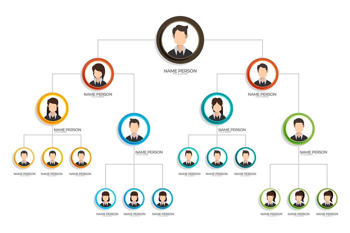
An organizational chart, often called an org chart, is a visual representation of an organization’s structure, showing the relationships, roles, and hierarchy among its members. Typically structured as a tree diagram, an organizational chart provides a clear picture of reporting lines and relationships, making it easier to understand how teams and individuals are connected within a company or institution.
General Overview of Organizational Charts
Visualization Name: Organizational Chart
Visualization Category: Hierarchy
Types of Organizational Charts
- Hierarchical Chart: Displays the classic top-down structure, where authority flows from senior leaders to subordinates.
- Matrix Chart: Represents dual reporting lines, such as project teams that report to both project managers and department heads.
- Flat Chart: Depicts organizations with minimal hierarchy, often used in small businesses or agile teams.
- Divisional Chart: Breaks the structure into separate divisions based on functions, products, or regions.
- Interactive Chart: Allows users to click on nodes to expand or explore additional details about roles and individuals.
Definition of Use Case
Organizational charts are used to map out the hierarchy, roles, and reporting lines within an organization, making them invaluable for onboarding, communication, and workflow optimization.
Why Use an Organizational Chart?
Organizational charts provide clarity on team structures, foster better communication, and streamline decision-making processes by making reporting relationships transparent. They are essential for managing growth, restructuring, or project organization.
Significance in Data Analysis
Organizational charts help identify bottlenecks, resource gaps, or inefficiencies in reporting structures. They are also used to plan succession, restructure departments, or analyze workforce distribution.
Structure and Components of an Organizational Chart
Key Elements
- Nodes: Represent individuals or roles, typically displayed as boxes or circles with names, titles, or photos.
- Connections: Lines linking nodes represent reporting relationships or lines of authority.
- Levels: Show the hierarchy, with senior leaders at the top and lower levels representing subordinates or team members.
- Labels: Provide names, job titles, departments, or additional details about individuals or roles.
- Color Coding: Highlights different departments, teams, or functions for easier visualization.
Usage Scenarios
When to Use an Organizational Chart?
- Team Structure Planning: Mapping out teams and reporting lines to ensure balanced workloads and clear communication.
- Onboarding New Employees: Helping new hires understand the company structure and their place within it.
- Workforce Analysis: Identifying gaps, redundancies, or areas for restructuring in an organization.
- Succession Planning: Visualizing leadership roles and identifying potential successors for key positions.
- Project Organization: Mapping temporary structures for cross-functional teams working on projects.
When Not to Use an Organizational Chart?
- Dynamic Team Structures: Use network diagrams or matrix charts for fluid teams with complex reporting lines.
- Small Groups: Simple text lists or tables may suffice for very small teams or startups.
- Time-Based Data: Line charts or Gantt charts are more suitable for showing timelines and schedules.
- Workflows: Flowcharts are better for representing processes or task sequences rather than hierarchical structures.
- Large Organizations: For large organizations, org charts may become too complex; summaries or interactive charts are more practical.
Interpretation Guidelines
- Start at the Top: Identify the senior-most position and work downwards through the hierarchy.
- Trace Connections: Follow lines to understand reporting relationships and team structures.
- Analyze Levels: Note the number of levels in the chart to assess the organization’s depth and hierarchy.
- Focus on Colors: Use color coding to identify departments, teams, or functional areas quickly.
- Look for Gaps or Bottlenecks: Identify roles or positions with excessive reporting lines that may indicate inefficiencies.
Strengths and Weaknesses of Organizational Charts
Advantages
- Clear Structure: Provides an intuitive overview of roles, relationships, and hierarchy.
- Improved Communication: Helps employees understand reporting lines and team responsibilities.
- Effective Planning: Aids in workforce planning, succession management, and departmental restructuring.
- Customizable: Can include additional details like contact information, photos, or responsibilities.
- Versatile Applications: Used in business, education, and government for mapping organizational structures.
Limitations
- Limited Scalability: Becomes cluttered and hard to read for very large organizations or complex structures.
- Static Representation: Does not show dynamic or evolving structures unless interactive features are used.
- Lacks Process Representation: Does not represent workflows, processes, or inter-departmental interactions.
- Over-Simplification: May oversimplify relationships, especially in organizations with informal or matrix structures.
- Maintenance Challenges: Requires frequent updates to reflect organizational changes accurately.
Design Best Practices
- Limit Complexity: Break large charts into smaller sections (e.g., by department) to maintain readability.
- Use Clear Labels: Ensure names, job titles, and roles are clearly displayed for easy interpretation.
- Incorporate Colors: Use color coding to differentiate teams, departments, or regions.
- Include Interactive Features: Allow users to click on nodes for detailed information in digital versions.
- Maintain Consistency: Use a uniform layout, font, and size to make the chart visually cohesive.
Examples of Organizational Charts
Simple Examples
- Small Business Structure: Showing a simple hierarchy with roles like CEO, Managers, and Employees.
- Departmental Chart: Visualizing the structure of a specific department, such as HR or IT.
- Startup Team Chart: Highlighting a flat hierarchy with roles like Founder, Developers, and Marketers.
- Education Institution Chart: Mapping roles like Principal, Teachers, and Support Staff.
- Family Tree: Representing familial relationships in a similar format to an org chart.
Advanced Examples
- Corporate Structure: Displaying the hierarchy of a large corporation with multiple departments and divisions.
- Government Agency Chart: Visualizing roles and relationships in public institutions like ministries or councils.
- Project-Based Organization: Showing a temporary structure with cross-functional teams and dual reporting lines.
- Healthcare Institution Chart: Mapping out roles in a hospital, including doctors, nurses, administrators, and specialists.
- Global Enterprise Chart: Representing regional offices, country managers, and international reporting lines.
Comparison with Similar Visualizations
Similarities
- Org Chart vs. Tree Diagram: Both use hierarchical structures, though org charts focus on people and roles.
- Org Chart vs. Network Map: Both visualize relationships, though network maps handle complex interconnections better.
- Org Chart vs. Flowchart: Both use nodes and connections, though flowcharts focus on workflows rather than hierarchy.
- Org Chart vs. Matrix Chart: Both represent relationships, though matrix charts emphasize cross-functional reporting.
- Org Chart vs. Mind Map: Both organize information visually, but mind maps focus on brainstorming and idea generation.
Differences
- Org Chart vs. Tree Diagram: Tree diagrams can represent abstract data, while org charts focus specifically on organizational roles.
- Org Chart vs. Network Map: Network maps handle non-hierarchical relationships better, such as cross-department interactions.
- Org Chart vs. Flowchart: Flowcharts represent processes, while org charts focus on authority and roles.
- Org Chart vs. Matrix Chart: Matrix charts are better for visualizing dual reporting lines, while org charts emphasize hierarchical structure.
- Org Chart vs. Mind Map: Mind maps are less structured and better for ideation, while org charts provide formal structure visualization.
Conclusion
Organizational charts are an invaluable tool for visualizing hierarchy, roles, and reporting lines within a company or institution. They provide clarity on team structures, foster better communication, and support strategic decision-making. By adhering to design best practices and keeping the chart up to date, organizational charts can enhance collaboration, planning, and efficiency across diverse organizational contexts.