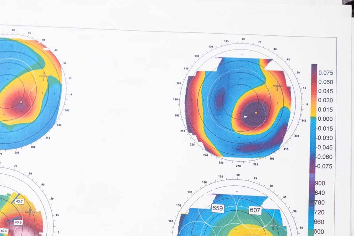
A heatmap is a data visualization technique that uses color to represent values in a matrix or grid. The intensity of the color corresponds to the magnitude of the value, making it easy to identify patterns, trends, and outliers in large datasets. Heatmaps are widely used in fields like finance, marketing, biology, and web analytics for their ability to present complex data in a visually intuitive manner.
General Overview of Heatmaps
Visualization Name: Heatmap
Visualization Category: Multivariate
Types of Heatmaps
- Clustered Heatmap: Groups rows and columns with similar patterns, often using hierarchical clustering.
- Correlation Heatmap: Displays pairwise correlations between variables, often in a symmetric matrix.
- Geographical Heatmap: Uses geographic regions as the grid, with color intensity showing data values (e.g., population density).
- Web Heatmap: Highlights user interactions on a webpage, such as clicks, hovers, or scrolling activity.
- Calendar Heatmap: Represents data over time, such as daily activity or trends over weeks and months.
Definition of Use Case
Heatmaps are used to represent data distributions, relationships, and intensities in a visually digestible format. They are especially effective for analyzing patterns, highlighting variations, and exploring correlations within datasets.
Why Use a Heatmap?
Heatmaps are visually intuitive and allow viewers to identify patterns at a glance. Their use of color gradients provides a clear representation of variations, making them suitable for large datasets with complex relationships.
Significance in Data Analysis
Heatmaps are an essential tool for exploratory data analysis. They help analysts detect trends, correlations, and outliers while summarizing large volumes of data into an easily interpretable format.
Structure and Components of Heatmaps
Key Elements
- Grid Cells: Represent individual data points, with each cell’s color corresponding to its value.
- Color Scale: A gradient or range of colors used to encode values (e.g., red for high values, blue for low values).
- Row and Column Labels: Identify categories, variables, or dimensions represented in the grid.
- Annotations (Optional): Text or symbols within cells providing additional information, such as exact values.
- Clustering (Optional): Groups similar rows and columns to highlight patterns and relationships.
Usage Scenarios
When to Use a Heatmap?
- Correlation Analysis: Visualizing pairwise correlations between variables in a dataset.
- Activity Tracking: Representing user activity over time, such as daily website visits or customer transactions.
- Geographical Analysis: Displaying data like population density or sales performance across regions.
- Performance Monitoring: Analyzing server performance, response times, or resource utilization in IT systems.
- Genomic Studies: Visualizing gene expression data or protein interactions in biological research.
When Not to Use a Heatmap?
- Small Datasets: Use bar or scatter plots for datasets with few data points or variables.
- Exact Comparisons: Tables or bar charts are more effective for precise numerical comparisons.
- Time-Series Trends: Line charts or area charts are better for visualizing changes over time.
- Hierarchical Data: Use treemaps or sunburst charts for datasets with clear parent-child relationships.
- Overlapping Categories: Consider bubble charts or scatter plots if categories overlap significantly.
Interpretation Guidelines
- Understand the Color Scale: Examine the legend to understand how colors correspond to data values.
- Look for Patterns: Identify areas of high or low intensity to detect trends, clusters, or anomalies.
- Analyze Rows and Columns: Compare relationships between variables by focusing on row and column intersections.
- Identify Clusters: Observe groups of similar values to uncover patterns or correlations within the data.
- Focus on Anomalies: Highlight outliers or unexpected variations in the data for further investigation.
Strengths and Weaknesses of Heatmaps
Advantages
- Intuitive Representation: Colors provide a quick visual cue for understanding data distributions and relationships.
- Scalable: Can accommodate large datasets, summarizing them effectively in a compact format.
- Pattern Recognition: Highlights trends, clusters, and anomalies that might be missed in raw data tables.
- Customizable: Supports additional features such as clustering, annotations, and interactive elements.
- Wide Applications: Useful in diverse fields, from marketing analytics to scientific research and IT operations.
Limitations
- Color Interpretation Challenges: Subtle gradients or poor color choices can make it hard to interpret values accurately.
- Loss of Precision: Focuses on general patterns rather than exact numerical comparisons.
- Clutter with Large Datasets: Dense grids with too many rows and columns can become visually overwhelming.
- Dependence on Scaling: Improper normalization or scaling of data can distort interpretations.
- Static Representation: Non-interactive heatmaps may lack depth for exploring complex datasets.
Design Best Practices
- Choose an Appropriate Color Scale: Use intuitive and colorblind-friendly palettes for better accessibility and interpretation.
- Normalize Data: Scale values appropriately to ensure meaningful comparisons across rows and columns.
- Label Clearly: Include descriptive labels for rows, columns, and the color scale to guide viewers.
- Reduce Clutter: Focus on key variables or clusters, and consider using hierarchical clustering to group similar rows or columns.
- Incorporate Interactivity: Add hover, zoom, or filtering features for large datasets to allow dynamic exploration.
Examples of Heatmaps
Simple Examples
- Correlation Analysis: Visualizing correlations between variables in a financial dataset.
- Website Analytics: Displaying user clicks or hover activity on a webpage to identify engagement hotspots.
- Sales Performance: Representing product sales across regions and time periods.
- Server Monitoring: Showing server response times or CPU usage across different time intervals.
- Survey Data: Mapping responses to survey questions by demographics or categories.
Advanced Examples
- Genomic Studies: Visualizing gene expression data to identify patterns in biological research.
- Climate Analysis: Displaying temperature variations across geographic regions and time periods.
- Financial Market Trends: Representing stock performance correlations across multiple industries.
- Supply Chain Analysis: Mapping inventory levels or shipment delays across warehouses and regions.
- Marketing Campaigns: Analyzing ad click-through rates across different channels and customer segments.
Comparison with Similar Visualizations
Similarities
- Heatmap vs. Choropleth Map: Both use color intensity to represent data, but choropleth maps are geographical, while heatmaps are grid-based.
- Heatmap vs. Bubble Chart: Both compare variables, though bubble charts use size and position instead of color intensity.
- Heatmap vs. Matrix Chart: Both display data in a grid, though heatmaps rely on color to represent values.
- Heatmap vs. Bar Chart: Both summarize data, but heatmaps visualize relationships and distributions more effectively.
- Heatmap vs. Line Chart: Both can show trends, but heatmaps focus on relationships between multiple variables simultaneously.
Differences
- Heatmap vs. Choropleth Map: Heatmaps are flexible for non-geographical data, while choropleth maps are limited to geographic visualizations.
- Heatmap vs. Bubble Chart: Bubble charts are better for representing three variables, while heatmaps focus on two-dimensional grids.
- Heatmap vs. Matrix Chart: Matrix charts use numerical or categorical annotations, while heatmaps use colors to encode values.
- Heatmap vs. Bar Chart: Bar charts provide precise value comparisons, while heatmaps emphasize patterns and relationships.
- Heatmap vs. Line Chart: Line charts are ideal for continuous trends over time, while heatmaps explore multidimensional data relationships.
Conclusion
Heatmaps are an excellent tool for visualizing data patterns, relationships, and distributions in an intuitive and compact format. They are versatile, scalable, and widely applicable across fields, from analytics and research to decision-making and performance monitoring. By adhering to best practices and focusing on clear, accessible designs, heatmaps can simplify complex datasets and provide actionable insights.