A radar chart, also known as a spider chart or web chart, is a data visualization technique used to compare multiple variables simultaneously. It arranges variables as axes radiating out from a central point, with data values plotted along these axes. Lines connecting the data points form a polygon, which provides a visual representation of relationships, patterns, and outliers across multiple dimensions. Radar charts are widely used in performance analysis, comparative studies, and decision-making.
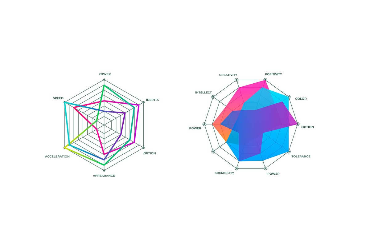
General Overview of Radar Charts
Visualization Name: Radar Chart
Visualization Category: Multivariate
Types of Radar Charts
- Standard Radar Chart: Displays multiple data sets with individual polygons for each.
- Filled Radar Chart: Shades the area within the polygon to emphasize magnitude.
- Interactive Radar Chart: Includes hover, zoom, or clickable features for detailed exploration.
- Normalized Radar Chart: Scales all data values to a common range (e.g., 0–1) to ensure fair comparisons.
- Clustered Radar Chart: Groups multiple variables or data points to highlight clusters or patterns.
Definition of Use Case
Radar charts are used to analyze and compare data across multiple dimensions. They are particularly effective for assessing strengths and weaknesses or profiling entities across a set of criteria.
Why Use a Radar Chart?
Radar charts provide an intuitive way to visualize and compare multidimensional data, highlighting relative performance, disparities, and trends. They are ideal for understanding data at a glance and comparing entities across several variables.
Significance in Data Analysis
Radar charts are valuable in exploratory data analysis, allowing analysts to detect patterns, similarities, or outliers in multidimensional datasets. They support strategic decision-making by offering clear insights into variable relationships.
Structure and Components of a Radar Chart
Key Elements
- Axes: Radiate from a central point, each representing one variable.
- Gridlines: Concentric circles or polygons that serve as reference points for the scale of the variables.
- Data Points: Plotted along each axis based on the value of the corresponding variable.
- Polygon: Formed by connecting data points, providing a visual representation of the entity being analyzed.
- Colors: Used to differentiate between entities or datasets being compared.
- Labels: Indicate the names or descriptions of the variables represented by the axes.
Usage Scenarios
When to Use a Radar Chart?
- Performance Evaluation: Comparing employee skills, team effectiveness, or company performance metrics.
- Product Comparison: Assessing products based on features such as price, durability, and usability.
- Market Analysis: Visualizing market segments or competitor profiles based on key factors.
- Survey Analysis: Displaying respondent satisfaction or preferences across multiple criteria.
- Sports Analytics: Comparing player performance metrics such as speed, accuracy, and endurance.
When Not to Use a Radar Chart?
- Few Variables: Use bar charts or line charts for datasets with fewer than three variables.
- Large Number of Variables: Radar charts can become cluttered and difficult to interpret with too many axes.
- Precise Numerical Comparisons: Use bar charts or tables for detailed numerical analysis.
- Time-Series Data: Line charts or area charts are more effective for visualizing trends over time.
- Hierarchical Data: Use treemaps or sunburst charts to visualize hierarchical relationships.
Interpretation Guidelines
- Understand the Axes: Identify the variables represented by each axis to provide context for the chart.
- Analyze Polygon Shapes: Look for symmetry, irregularities, or distinctive shapes that indicate patterns or outliers.
- Compare Polygons: Evaluate overlapping polygons or gaps between them to identify similarities or differences.
- Use Gridlines: Reference gridlines to assess the relative magnitudes of variables.
- Focus on Colors: Use color coding to distinguish between different datasets or entities effectively.
Strengths and Weaknesses of Radar Charts
Advantages
- Multidimensional Analysis: Visualizes relationships across multiple variables simultaneously.
- Intuitive Patterns: Makes it easy to identify strengths, weaknesses, and overall profiles at a glance.
- Relative Comparison: Highlights disparities between entities or datasets effectively.
- Customizable: Supports interactivity, shading, and color coding for enhanced analysis.
- Compact Representation: Summarizes complex datasets in a concise and visually appealing format.
Limitations
- Cluttered with Many Variables: Charts with too many axes or datasets can be overwhelming and hard to read.
- Not Ideal for Exact Values: Better suited for relative comparisons than precise numerical analysis.
- Axis Scaling Issues: Differences can appear exaggerated or understated if axes are not scaled consistently.
- Limited Scalability: Difficult to interpret with a large number of datasets or categories.
- Static Representation: Without interactivity, complex radar charts can lose clarity and usability.
Design Best Practices
- Limit Variables: Use a manageable number of variables (5–10) to prevent overcrowding.
- Normalize Data: Scale variables to a common range (e.g., 0–1 or 0–100) for meaningful comparisons.
- Use Distinct Colors: Apply contrasting colors to differentiate datasets or entities clearly.
- Label Clearly: Ensure axis labels and gridlines are well-defined to aid interpretation.
- Incorporate Interactivity: Add hover or zoom features to explore complex or detailed datasets dynamically.
Examples of Radar Charts
Simple Examples
- Employee Skill Assessment: Comparing employee proficiency in communication, leadership, and technical skills.
- Product Features: Evaluating laptops based on performance, portability, and battery life.
- Survey Results: Visualizing customer satisfaction across service, quality, and price categories.
- Fitness Profiles: Tracking endurance, strength, and flexibility for individuals or groups.
- Department Analysis: Comparing departmental metrics such as productivity, budget utilization, and employee satisfaction.
Advanced Examples
- Market Segmentation: Profiling customer segments by spending habits, loyalty, and preferences.
- Sports Performance: Comparing athletes across metrics like agility, strength, and strategy execution.
- Competitor Analysis: Evaluating competitors based on pricing, quality, and brand perception.
- Environmental Studies: Assessing ecosystems by biodiversity, pollution, and resource availability.
- Educational Analytics: Analyzing student performance across subjects like math, science, and language arts.
Comparison with Similar Visualizations
Similarities
- Radar Chart vs. Bar Chart: Both compare variables, though radar charts allow for simultaneous multidimensional analysis.
- Radar Chart vs. Line Chart: Both connect data points, though radar charts emphasize relationships across categories rather than trends over time.
- Radar Chart vs. Bubble Chart: Both handle multivariable data, but radar charts use radial layouts instead of Cartesian coordinates.
- Radar Chart vs. Heatmap: Both show patterns across variables, though heatmaps aggregate data into a grid format.
- Radar Chart vs. Treemap: Both can summarize datasets, though treemaps focus on hierarchical structures.
Differences
- Radar Chart vs. Bar Chart: Bar charts are better for precise comparisons, while radar charts highlight patterns and profiles.
- Radar Chart vs. Line Chart: Line charts excel in time-series data, while radar charts are best for comparing multiple dimensions.
- Radar Chart vs. Bubble Chart: Bubble charts focus on distributions, while radar charts emphasize variable relationships.
- Radar Chart vs. Heatmap: Heatmaps are better for summarizing large datasets, while radar charts are ideal for compact multidimensional comparisons.
- Radar Chart vs. Treemap: Treemaps focus on part-to-whole relationships, while radar charts emphasize relative performance across variables.
Conclusion
Radar charts are an effective visualization tool for comparing multidimensional data in a compact, intuitive format. They provide a clear overview of strengths, weaknesses, and patterns, making them valuable for performance analysis, decision-making, and strategic planning. By following design best practices and managing complexity, radar charts can convey insights effectively across various industries and use cases.