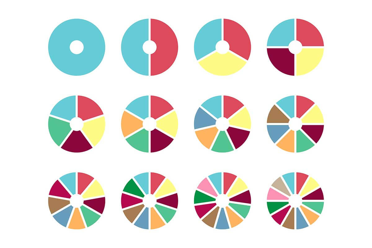
Donut charts, a variation of pie charts, are circular visualizations that display data as proportional segments of a whole. Unlike pie charts, donut charts have a hollow center, which provides space for labels, totals, or other contextual information. They are particularly useful for showcasing part-to-whole relationships while offering additional flexibility in design and data presentation.
General Overview of Donut Charts
Visualization Name: Donut Chart
Visualization Category: Part-to-Whole
Types of Donut Charts
- Simple Donut Chart: A basic chart with a single data series represented as proportional segments.
- Multilevel Donut Chart: Also known as a nested or multi-ring donut chart, used to display hierarchical data.
- Exploded Donut Chart: Highlights specific segments by pulling them slightly away from the center.
- Percentage-Based Donut Chart: Emphasizes percentages for each segment, often displayed in the center.
Definition of Use Case
Donut charts are used to visualize part-to-whole relationships within a dataset, similar to pie charts. They are particularly effective when there is a need to display additional context or emphasize totals using the chart’s hollow center.
Why Use a Donut Chart?
Donut charts provide the same part-to-whole insights as pie charts but offer greater flexibility by utilizing the hollow center for totals, labels, or visual emphasis. They are ideal for conveying proportions while maintaining a clean and modern aesthetic.
Significance in Data Analysis
Donut charts are widely used in data analysis to summarize proportions and provide a quick understanding of category contributions. Their flexibility and clarity make them valuable tools for presentations, dashboards, and infographics.
Structure and Components of a Donut Chart
Key Elements
- Segments: Represent categories or subcategories, with each segment proportional to its value.
- Hollow Center: Provides space for additional information, such as totals, labels, or percentages.
- Colors: Differentiate segments to improve clarity and enhance visual appeal.
- Labels: Display category names, values, or percentages, often placed near segments or inside the hollow center.
- Legend: Explains the color coding and categories represented in the chart.
Usage Scenarios
When to Use a Donut Chart?
- Part-to-Whole Relationships: Showing how individual categories contribute to a total, such as market share or budget distribution.
- Data with Totals: Highlighting a total value in the center of the chart for added context.
- Hierarchical Data: Using nested donut charts to represent multiple levels of data, such as department and sub-department budgets.
- Survey Results: Visualizing response distributions, such as customer satisfaction ratings.
- Dashboard Metrics: Providing a compact, aesthetically pleasing visualization for dashboards.
When Not to Use a Donut Chart?
- Too Many Categories: Charts with more than 5–7 segments can become cluttered and hard to interpret.
- Precise Comparisons: Bar or column charts are better suited for comparing exact values across categories.
- Time-Series Data: Line or area charts are better for visualizing trends over time.
- Data with Negative Values: Donut charts are not designed to represent negative or zero values effectively.
- Dense Hierarchical Data: Treemaps or sunburst charts may be better for visualizing complex hierarchies.
Interpretation Guidelines
- Focus on Segment Sizes: Larger segments represent greater proportions of the whole.
- Use the Center: Pay attention to information in the hollow center, such as totals or key metrics.
- Examine Labels: Look for category names and values displayed near the segments for better understanding.
- Compare Key Segments: Identify the most significant and least significant categories based on their size.
- Check Color Coding: Use the legend to match colors to their respective categories.
Strengths and Weaknesses of Donut Charts
Advantages
- Modern Aesthetic: Offers a visually appealing, cleaner design compared to traditional pie charts.
- Utilizes Center Space: Provides additional functionality by displaying totals, labels, or other metrics in the center.
- Summarizes Proportions: Clearly shows how parts contribute to the whole.
- Flexible Variations: Can be adapted to represent hierarchical or nested data.
- Engaging Design: Well-suited for infographics and dashboards.
Limitations
- Limited Precision: Exact comparisons between segments can be difficult without labels or additional context.
- Clutter with Many Categories: Too many segments can make the chart hard to interpret.
- Static Data Representation: Cannot show trends or changes over time effectively.
- No Negative Values: Not suitable for data containing negative or zero values.
- Dependence on Color: Overreliance on color coding can make the chart less accessible to colorblind users.
Design Best Practices
- Limit Segments: Avoid using more than 5–7 categories to maintain clarity and readability.
- Use the Center Wisely: Display key metrics, totals, or percentages in the hollow center for added value.
- Choose Distinct Colors: Apply a consistent and contrasting color palette to differentiate segments.
- Label Clearly: Include category names, values, or percentages for better interpretation.
- Provide a Legend: Use a legend to explain color coding and ensure accessibility for all viewers.
Examples of Donut Charts
Simple Examples
- Market Share: Visualizing the percentage of market share held by various competitors.
- Budget Allocation: Showing how a company’s budget is divided among departments.
- Survey Results: Displaying response distributions, such as customer satisfaction levels.
- Sales Contribution: Highlighting the percentage of total sales contributed by different products.
- Demographics: Representing population distribution by age group or region.
Advanced Examples
- Multi-Ring Donut Chart: Comparing overall revenue breakdowns by region and sub-region in nested rings.
- Dashboard Metrics: Using donut charts to represent KPIs such as revenue growth or customer acquisition rates.
- Marketing Campaign Analysis: Displaying the contribution of various channels (email, social media, paid ads) to overall conversions.
- Healthcare Data: Visualizing patient diagnosis distribution across different hospitals in a nested donut chart.
- Financial Analysis: Showing expense breakdowns by category and subcategory for a fiscal year.
Comparison with Similar Visualizations
Similarities
- Donut vs. Pie Chart: Both display part-to-whole relationships, using proportional segments to represent categories.
- Donut vs. Treemap: Both visualize proportions, although treemaps use rectangles instead of circular segments.
- Donut vs. Sunburst Chart: Both represent hierarchical data and can display multiple levels of information.
- Donut vs. Stacked Bar Chart: Both show proportions within categories, but stacked bar charts do so linearly instead of circularly.
- Donut vs. Area Chart: Both highlight proportions, but donut charts are static, while area charts are often used to show changes over time.
Differences
- Donut vs. Pie Chart: Pie charts use the full circle for data representation, while donut charts have a hollow center for additional context.
- Donut vs. Treemap: Treemaps are better suited for larger datasets or hierarchical relationships, whereas donut charts are simpler and visually focused.
- Donut vs. Sunburst Chart: Sunburst charts use concentric layers to show detailed subcategories, while donut charts typically focus on a single layer of data.
- Donut vs. Stacked Bar Chart: Stacked bar charts are better for precise comparisons across categories, while donut charts emphasize overall proportions.
- Donut vs. Area Chart: Area charts visualize trends or changes over time, whereas donut charts are static and display a snapshot of proportions.
Conclusion
Donut charts are a modern and versatile visualization tool for representing part-to-whole relationships. By utilizing their hollow center for additional context, they go beyond the traditional pie chart to offer enhanced functionality and visual appeal. When designed effectively, donut charts are ideal for summarizing data in dashboards, presentations, and infographics, making them a favorite for data professionals and communicators alike.