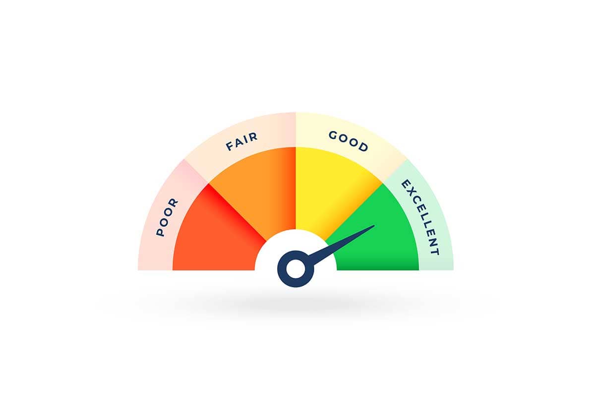
A gauge chart, also known as a speedometer chart or dial chart, is a data visualization tool that displays a single data value within a range. It resembles a speedometer, with a needle pointing to the current value and segments of the dial representing ranges of significance (e.g., low, medium, and high). Gauge charts are often used to measure performance, progress, or KPIs (Key Performance Indicators) relative to a target value.
General Overview of Gauge Charts
Visualization Name: Gauge Chart
Visualization Category: Part-to-Whole
Types of Gauge Charts
- Single Value Gauge: Displays one metric with a needle pointing to its position on a scale.
- Dual Needle Gauge: Includes two needles to represent two metrics on the same gauge.
- Donut Gauge: Uses a semi-circular or circular format with color-coded arcs to show progress.
- Bullet Gauge: A horizontal variation that uses a bar to show the value against target ranges.
- Interactive Gauge: Allows users to hover over the gauge for additional details or adjust thresholds dynamically.
Definition of Use Case
Gauge charts are used to represent a single metric and its performance or status against predefined benchmarks. They are particularly effective for real-time monitoring, dashboards, and performance tracking.
Why Use a Gauge Chart?
Gauge charts are visually intuitive and straightforward, making them ideal for presenting data to non-technical audiences. Their resemblance to physical dials or meters makes them effective for conveying metrics like speed, temperature, or completion progress.
Significance in Data Analysis
Gauge charts are useful for quick assessments of data relative to goals or thresholds. They simplify complex metrics into easily interpretable visuals, making them ideal for executive dashboards and monitoring systems.
Structure and Components of Gauge Charts
Key Elements
- Scale: The range of values displayed on the dial, representing the minimum and maximum values.
- Needle: A pointer indicating the current value on the scale.
- Color-Coded Segments: Divisions of the dial that represent ranges (e.g., red for low, yellow for moderate, green for high).
- Labels: Display the value or benchmarks for clarity, often including units (e.g., percentage or currency).
- Target Indicator (Optional): A marker or line that shows the desired or target value on the gauge.
Usage Scenarios
When to Use a Gauge Chart?
- Performance Tracking: Monitoring KPIs like sales, production efficiency, or revenue targets.
- Real-Time Monitoring: Displaying live data such as server load, network speed, or temperature.
- Project Progress: Showing task completion or progress toward milestones in a project.
- Customer Satisfaction: Representing metrics like Net Promoter Score (NPS) or satisfaction ratings.
- Energy Consumption: Visualizing energy usage relative to capacity or thresholds.
When Not to Use a Gauge Chart?
- Multivariable Data: Use bar charts, scatter plots, or line charts for datasets with multiple variables.
- Comparative Analysis: Avoid gauge charts if you need to compare multiple metrics simultaneously; grouped bar charts or line charts are more effective.
- Exact Numerical Analysis: Tables or numeric displays are better for analyzing precise values.
- Time-Series Data: Use line charts to show trends over time instead of a single snapshot value.
- Large Datasets: Gauge charts are ineffective for visualizing datasets with numerous data points or metrics.
Interpretation Guidelines
- Understand the Scale: Check the range and scale of the gauge to interpret the data accurately.
- Focus on the Needle: Observe the needle’s position to determine the current value relative to thresholds.
- Analyze Color Segments: Use the color coding to quickly assess whether the value is in a safe, warning, or critical range.
- Identify the Target: If included, compare the current value to the target or benchmark indicator.
- Context Matters: Use additional annotations or descriptions to understand the significance of the displayed metric.
Strengths and Weaknesses of Gauge Charts
Advantages
- Quick Assessment: Provides an instant visual cue for understanding the status of a single metric.
- Visually Intuitive: The dial format is familiar and easy to interpret for non-technical audiences.
- Focuses on a Single Metric: Ideal for emphasizing a key performance indicator or value.
- Customizable: Supports color coding, thresholds, and annotations for enhanced clarity.
- Compact Design: Fits well on dashboards alongside other visualizations for comprehensive monitoring.
Limitations
- Limited Data Representation: Can only display one or two metrics at a time, making it unsuitable for multidimensional analysis.
- Space Inefficiency: Requires significant screen real estate for a single data point compared to other chart types.
- Static View: Offers only a snapshot of data without showing trends or historical context.
- Potential Misinterpretation: May exaggerate the importance of a single metric over others in a dataset.
- Overuse of Color: Poorly designed gauge charts with excessive or unclear color segments can confuse viewers.
Design Best Practices
- Define Clear Ranges: Use well-defined color-coded segments to represent performance thresholds (e.g., low, moderate, high).
- Label Clearly: Include labels for the current value, scale, and benchmarks to improve interpretability.
- Use Target Indicators: Highlight the desired target value to provide context for the current metric.
- Minimize Clutter: Keep the design simple and avoid overloading the chart with unnecessary elements.
- Incorporate Interactivity: Add hover features or tooltips to provide additional information without crowding the chart.
Examples of Gauge Charts
Simple Examples
- Sales Tracking: Monitoring monthly revenue against a target goal.
- Server Load: Displaying real-time CPU or memory usage on a dashboard.
- Customer Satisfaction: Visualizing Net Promoter Scores on a satisfaction scale.
- Energy Usage: Showing current energy consumption relative to capacity limits.
- Task Progress: Indicating project completion percentage for a single task or milestone.
Advanced Examples
- Financial Performance: Displaying profit margin percentages compared to industry benchmarks.
- Logistics Metrics: Tracking delivery speed or shipment accuracy against targets in real time.
- Production Efficiency: Visualizing operational efficiency metrics, such as machine uptime, compared to optimal performance levels.
- Healthcare Monitoring: Showing real-time patient vitals, such as heart rate, compared to normal ranges.
- Environmental Monitoring: Indicating air quality index or water usage compared to sustainable thresholds.
Comparison with Similar Visualizations
Similarities
- Gauge Chart vs. Progress Bar: Both represent a single metric’s status relative to a goal or threshold.
- Gauge Chart vs. Pie Chart: Both use segments to represent proportions, though gauge charts emphasize ranges rather than parts-to-whole relationships.
- Gauge Chart vs. Bullet Chart: Both are used for performance tracking, though bullet charts are linear and compact.
- Gauge Chart vs. Column Chart: Both display a single data point in comparison to a scale, but column charts provide a more traditional layout.
- Gauge Chart vs. Dial Chart: These are essentially the same visualization but may vary slightly in design.
Differences
- Gauge Chart vs. Progress Bar: Progress bars show cumulative progress, while gauge charts use a dial format for ranges and real-time values.
- Gauge Chart vs. Pie Chart: Pie charts emphasize proportional relationships, while gauge charts focus on a single metric relative to benchmarks.
- Gauge Chart vs. Bullet Chart: Bullet charts are better for comparing a metric to multiple benchmarks in a compact space.
- Gauge Chart vs. Column Chart: Column charts are better for datasets with multiple categories or metrics, while gauge charts are for single metrics.
- Gauge Chart vs. Dial Chart: Dial charts may represent multiple needles or metrics, while gauge charts often focus on a single value.
Conclusion
Gauge charts are a highly intuitive visualization for tracking a single metric against predefined thresholds. Their design is particularly well-suited for dashboards, real-time monitoring, and performance tracking. By following best practices, such as clear labeling, effective use of color, and incorporating interactivity, gauge charts can provide actionable insights and enhance decision-making in various domains, from business to healthcare and beyond.