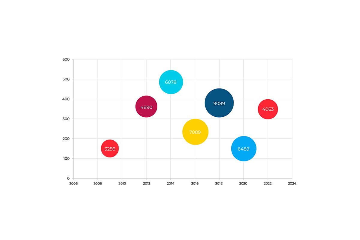
A bubble chart is a type of scatter plot where data points are represented as bubbles. The position of each bubble along the X and Y axes represents two variables, while the size of the bubble (radius) encodes a third variable. Bubble charts are widely used for visualizing relationships between three numerical variables and are especially effective for highlighting trends, clusters, and outliers in multivariate datasets.
General Overview of Bubble Charts
Visualization Name: Bubble Chart
Visualization Category: Relationship
Types of Bubble Charts
- Standard Bubble Chart: Uses X and Y positions for two variables and bubble size for a third variable.
- Colored Bubble Chart: Adds a fourth variable by coloring the bubbles according to categories or ranges.
- Packed Bubble Chart: Displays bubbles grouped tightly together without axes, focusing on size comparisons.
- Interactive Bubble Chart: Allows users to hover, zoom, or click on bubbles to explore detailed data.
- Time-Series Bubble Chart: Animates bubble movement over time to show dynamic changes in relationships.
Definition of Use Case
Bubble charts are used to visualize relationships between three or more variables, particularly when size and positional relationships are critical. They are ideal for exploring correlations, distributions, or patterns in multidimensional datasets.
Why Use a Bubble Chart?
Bubble charts provide an engaging and intuitive way to visualize complex datasets. They combine positional and size-based data encoding, making them suitable for comparing multiple variables simultaneously.
Significance in Data Analysis
Bubble charts enable analysts to uncover correlations, clusters, and outliers while examining three or more variables simultaneously. They are particularly useful for exploratory data analysis and presentations.
Structure and Components of a Bubble Chart
Key Elements
- Bubbles: Represent data points, with their size proportional to the third variable.
- X-Axis: Encodes one numerical variable, such as time, quantity, or price.
- Y-Axis: Represents a second numerical variable for comparison against the X-axis.
- Size: The radius or area of each bubble represents a third variable, such as revenue, population, or sales.
- Color (Optional): Differentiates categories or encodes a fourth variable for added insights.
- Annotations: Labels or tooltips provide additional context about individual bubbles.
Usage Scenarios
When to Use a Bubble Chart?
- Sales Analysis: Comparing revenue, profit margin, and product categories simultaneously.
- Market Analysis: Mapping market share, growth, and regional presence of companies.
- Customer Segmentation: Visualizing customer demographics and spending behavior.
- Healthcare Data: Examining relationships between patient age, treatment cost, and health outcomes.
- Resource Allocation: Comparing project costs, durations, and priority levels.
When Not to Use a Bubble Chart?
- Few Variables: Use scatter plots for simpler two-variable comparisons.
- Large Datasets: Bubble charts can become cluttered with too many data points; consider filtering or sampling.
- Exact Comparisons: Bar charts or tables are more precise for comparing specific numerical values.
- High Precision Needs: Avoid bubble charts when small differences in values need to be distinguished accurately.
- Non-Numerical Data: Use categorical charts like bar charts or pie charts for non-numeric data.
Interpretation Guidelines
- Understand the Axes: Identify the X and Y axes and their corresponding variables to interpret positional relationships.
- Analyze Bubble Sizes: Compare bubble sizes to evaluate the third variable, such as magnitude or importance.
- Focus on Clusters: Look for groups of bubbles that suggest patterns, trends, or shared characteristics.
- Detect Outliers: Identify bubbles that deviate significantly from the overall pattern for further investigation.
- Use Color and Annotations: Refer to color coding and labels to understand categories or additional variables.
Strengths and Weaknesses of Bubble Charts
Advantages
- Multivariable Representation: Visualizes three to four variables in a single chart effectively.
- Pattern Recognition: Highlights correlations, clusters, and outliers in the dataset.
- Engaging Visuals: Provides an eye-catching way to communicate complex data.
- Customizable: Allows for interactivity, color coding, and dynamic features to enhance exploration.
- Flexible Applications: Suitable for various fields, including business, research, and healthcare.
Limitations
- Size Misinterpretation: Viewers may struggle to interpret bubble sizes accurately without a clear legend.
- Clutter: Too many bubbles can overlap, making the chart hard to read.
- Perceptual Bias: Humans may perceive the area of bubbles inaccurately, leading to misinterpretation.
- Limited Comparisons: Not ideal for precise or detailed numerical comparisons.
- Axis Dependency: The interpretation can vary based on the scaling and choice of variables for the axes.
Design Best Practices
- Use Appropriate Scaling: Ensure axis ranges and bubble sizes are scaled proportionally to avoid distortion.
- Limit Overlap: Filter or group data to reduce clutter and improve readability.
- Provide a Clear Legend: Include a legend for bubble sizes, colors, and categories to guide interpretation.
- Use Interactivity: Add hover or zoom features to allow detailed exploration of densely packed data points.
- Choose Colors Carefully: Use color coding to differentiate categories or encode additional variables without overwhelming the viewer.
Examples of Bubble Charts
Simple Examples
- Product Performance: Visualizing sales revenue, profit margin, and product categories.
- Website Analytics: Mapping page views, average time spent, and bounce rates for web pages.
- Survey Results: Comparing age, satisfaction scores, and income levels among respondents.
- Company Financials: Showing revenue, expenses, and market presence for businesses in an industry.
- Resource Allocation: Evaluating project costs, durations, and expected ROI.
Advanced Examples
- Market Segmentation: Analyzing customer segments by purchase frequency, spending habits, and loyalty tier.
- Climate Analysis: Visualizing relationships between temperature, humidity, and precipitation levels across locations.
- Healthcare Trends: Examining patient metrics such as age, treatment costs, and health outcomes by region.
- Financial Portfolio: Comparing stock performance by price, volume, and market cap across industries.
- Startup Ecosystem: Evaluating startup funding rounds, employee counts, and industry categories.
Comparison with Similar Visualizations
Similarities
- Bubble Chart vs. Scatter Plot: Both plot data points on X and Y axes, but bubble charts add a third variable with bubble size.
- Bubble Chart vs. Heatmap: Both can represent multivariable data, though heatmaps use colors and grid layouts instead of bubbles.
- Bubble Chart vs. Line Chart: Both can show trends, but line charts are better for continuous time-series data.
- Bubble Chart vs. Treemap: Both visualize proportions, though treemaps use rectangles instead of circles.
- Bubble Chart vs. Radar Chart: Both can represent multidimensional data, though radar charts focus on categories arranged in a radial format.
Differences
- Bubble Chart vs. Scatter Plot: Scatter plots only represent two variables, while bubble charts handle three or four variables.
- Bubble Chart vs. Heatmap: Heatmaps aggregate data into grids, while bubble charts show individual data points with spatial positioning.
- Bubble Chart vs. Line Chart: Line charts connect data points to show trends over time, while bubble charts display discrete data points.
- Bubble Chart vs. Treemap: Treemaps emphasize hierarchical structures, whereas bubble charts focus on variable relationships.
- Bubble Chart vs. Radar Chart: Radar charts are better for showing category-level comparisons, while bubble charts excel at continuous data relationships.
Conclusion
Bubble charts are an excellent tool for visualizing relationships between three or more variables in a visually engaging and intuitive way. Their ability to combine positional and size-based data encoding makes them valuable for both exploratory analysis and presentations. By adhering to design best practices and managing clutter, bubble charts can effectively communicate insights across various industries and applications.