A scatter plot is a type of data visualization that displays individual data points on a Cartesian coordinate system, with two variables plotted along the X and Y axes. Each point represents an observation, and its position indicates the values of the two variables being analyzed. Scatter plots are widely used for exploring relationships, identifying trends, and spotting outliers in datasets with continuous numerical data.
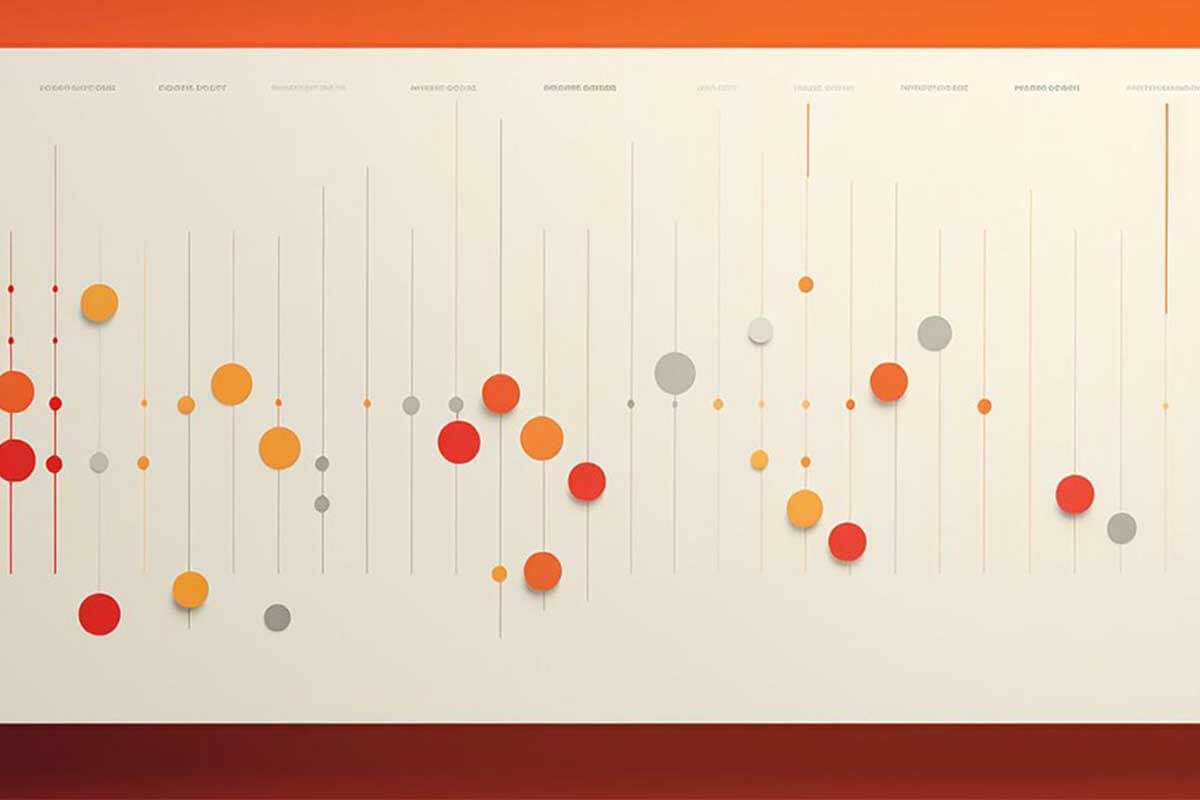
General Overview of Scatter Plots
Visualization Name: Scatter Plot
Visualization Category: Relationship
Types of Scatter Plots
- Simple Scatter Plot: Displays data points for two variables to analyze relationships.
- Bubble Scatter Plot: Adds a third variable by encoding its value as the size of the data points (bubbles).
- Colored Scatter Plot: Uses color to represent a third variable, such as categories or ranges.
- 3D Scatter Plot: Includes a third spatial dimension to analyze three variables simultaneously.
- Interactive Scatter Plot: Allows users to hover, zoom, or filter data points for additional details and exploration.
Definition of Use Case
Scatter plots are used to explore relationships between two numerical variables, identify clusters or patterns, and detect outliers in a dataset. They are particularly effective for correlation analysis and regression modeling.
Why Use a Scatter Plot?
Scatter plots are straightforward and visually intuitive, making them highly effective for understanding relationships between variables. They are ideal for identifying trends, clusters, and deviations in data.
Significance in Data Analysis
Scatter plots provide a visual framework for examining correlations, causations, and variable distributions. They are essential in regression analysis, hypothesis testing, and exploratory data analysis.
Structure and Components of Scatter Plots
Key Elements
- Data Points: Represent observations, with their position indicating values for two variables.
- X-Axis: Displays the independent variable, typically used for inputs or predictors.
- Y-Axis: Represents the dependent variable, often used for outcomes or responses.
- Gridlines: Provide reference points for interpreting the scale of the variables.
- Color and Size (Optional): Encode additional variables, such as categories, intensity, or importance.
- Trend Line (Optional): A regression or smoothing line added to show overall trends or correlations.
Usage Scenarios
When to Use a Scatter Plot?
- Correlation Analysis: Exploring the relationship between two variables, such as sales and advertising spend.
- Trend Identification: Visualizing trends in continuous data, such as temperature vs. energy consumption.
- Outlier Detection: Spotting data points that deviate significantly from the general pattern.
- Cluster Analysis: Identifying groups or clusters of similar data points, such as customer segments.
- Regression Modeling: Visualizing and validating linear or non-linear regression relationships.
When Not to Use a Scatter Plot?
- Non-Numerical Data: Use bar charts or pie charts for categorical data comparisons.
- Few Data Points: Scatter plots are less effective for datasets with very few observations.
- Overlapping Data Points: Dense or overlapping data can obscure relationships; use jittering or alternative charts like heatmaps.
- Time-Series Data: Use line charts or area charts for visualizing trends over time.
- Hierarchical Data: Treemaps or sunburst charts are more appropriate for visualizing hierarchical relationships.
Interpretation Guidelines
- Examine Axes: Identify the variables represented by the X and Y axes to understand the data context.
- Look for Patterns: Observe the distribution of points to identify trends, clusters, or correlations.
- Analyze Correlations: Determine whether the variables are positively, negatively, or not correlated based on the point arrangement.
- Spot Outliers: Identify points that deviate significantly from the main cluster or trend line.
- Use Additional Encodings: Leverage colors or sizes to analyze additional variables represented in the chart.
Strengths and Weaknesses of Scatter Plots
Advantages
- Intuitive Design: Easy to interpret for both technical and non-technical audiences.
- Multivariable Analysis: Supports additional variables using color, size, or 3D positioning.
- Highlights Patterns: Clearly visualizes trends, clusters, and deviations in data.
- Customizable: Allows for enhancements like trend lines, interactive features, and regression overlays.
- Flexible Applications: Suitable for diverse fields, including economics, healthcare, and environmental studies.
Limitations
- Overlapping Points: Dense data can obscure relationships; additional techniques like transparency or jittering may be needed.
- Requires Numerical Data: Only works with continuous variables, limiting its application for categorical datasets.
- Interpretation Challenges: May require additional context or statistical analysis to interpret effectively.
- Limited Scalability: Large datasets can become cluttered, reducing the chart’s effectiveness.
- Static Representation: Non-interactive scatter plots may fail to convey deeper insights for complex datasets.
Design Best Practices
- Use Appropriate Scaling: Ensure the axes are properly scaled to avoid distorting the data representation.
- Label Clearly: Provide concise labels for axes, points, and any additional variables for better understanding.
- Reduce Overlap: Use transparency, jittering, or aggregation techniques to minimize overlapping points.
- Add Trend Lines: Include regression or smoothing lines to help interpret overall trends or correlations.
- Incorporate Interactivity: Allow zooming, filtering, or tooltips to enable deeper exploration of large datasets.
Examples of Scatter Plots
Simple Examples
- Sales vs. Advertising: Exploring the relationship between advertising spend and sales revenue.
- Temperature vs. Energy Usage: Visualizing how temperature affects household energy consumption.
- Student Performance: Comparing hours of study to exam scores for a class of students.
- Height vs. Weight: Examining the correlation between height and weight in a population.
- Product Reviews: Plotting review scores against product prices to identify trends.
Advanced Examples
- Customer Segmentation: Analyzing customer demographics (e.g., income vs. age) to identify market segments.
- Healthcare Metrics: Comparing hospital admission rates to recovery times across different facilities.
- Economic Indicators: Visualizing GDP growth vs. unemployment rates for countries over time.
- Environmental Studies: Plotting air pollution levels against average temperatures to explore climate patterns.
- Financial Analysis: Analyzing stock performance by comparing risk vs. return across different assets.
Comparison with Similar Visualizations
Similarities
- Scatter Plot vs. Line Chart: Both plot data on X and Y axes, though scatter plots focus on individual points rather than trends over time.
- Scatter Plot vs. Bubble Chart: Both represent relationships, though bubble charts include a third variable through point size.
- Scatter Plot vs. Heatmap: Both visualize patterns, though heatmaps aggregate data into grids with color intensities.
- Scatter Plot vs. Bar Chart: Both compare data points, but scatter plots handle continuous variables, while bar charts are for categorical data.
- Scatter Plot vs. Histogram: Both display distributions, though scatter plots focus on relationships between variables, while histograms focus on frequency distributions.
Differences
- Scatter Plot vs. Line Chart: Line charts emphasize trends over time, while scatter plots focus on relationships between variables.
- Scatter Plot vs. Bubble Chart: Bubble charts add a third dimension with size, while scatter plots focus on two variables.
- Scatter Plot vs. Heatmap: Heatmaps aggregate data, while scatter plots visualize individual data points.
- Scatter Plot vs. Bar Chart: Bar charts are better for discrete categories, while scatter plots handle continuous data.
- Scatter Plot vs. Histogram: Histograms analyze a single variable’s distribution, while scatter plots analyze relationships between two variables.
Conclusion
Scatter plots are a powerful and versatile tool for exploring relationships between variables in a dataset. They offer an intuitive way to identify patterns, clusters, and outliers, making them invaluable for data exploration and analysis. By following best practices and enhancing the design with interactivity or additional encodings, scatter plots can effectively communicate complex insights across various fields and applications.