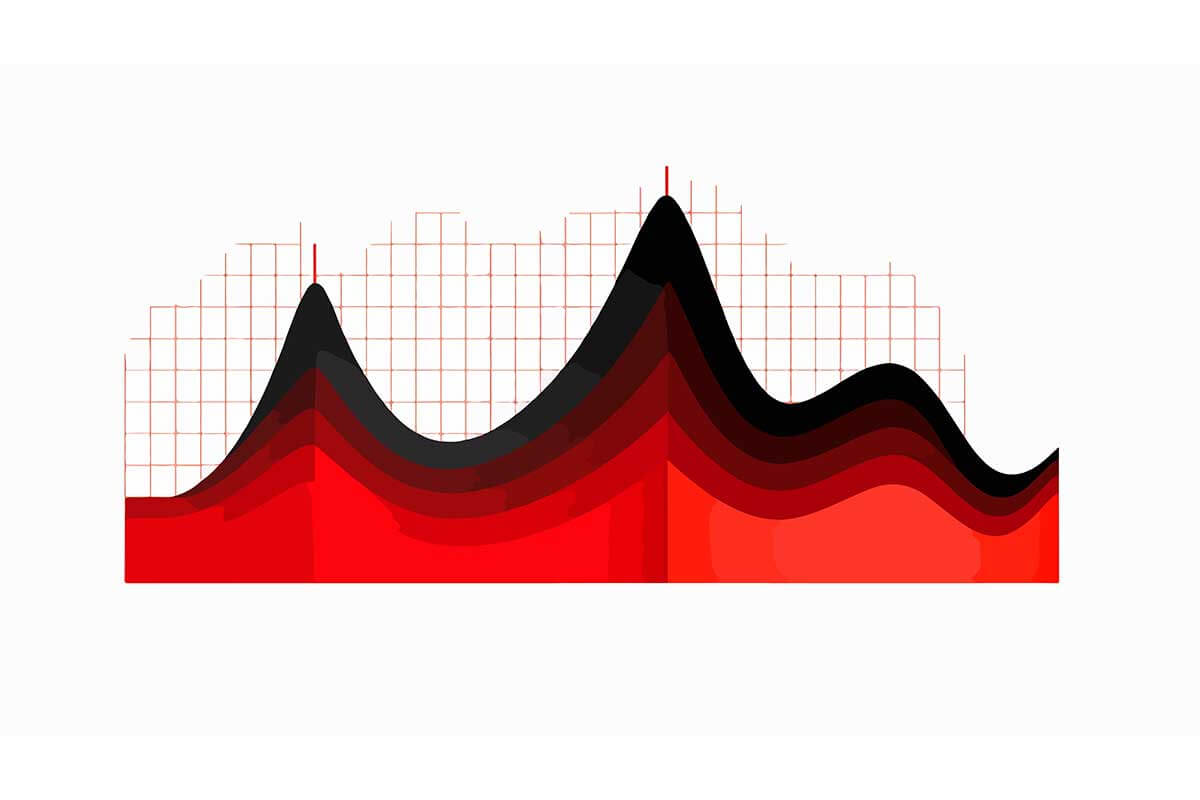
Stacked area charts are an extension of standard area charts where multiple data series are stacked on top of one another. Each layer represents a dataset, and the height of the cumulative area at any point shows the total value. These charts are ideal for visualizing part-to-whole relationships over time while simultaneously showing individual contributions of each data series.
General Overview of Stacked Area Charts
Visualization Name: Stacked Area Chart
Visualization Category: Temporal
Types of Stacked Area Charts
- Simple Stacked Area Chart: Displays multiple datasets stacked on top of each other to show both cumulative totals and individual contributions.
- 100% Stacked Area Chart: Normalizes data to 100%, focusing on the proportional contributions of datasets rather than absolute values.
- Smooth Stacked Area Chart: Uses curved lines to create a polished and fluid appearance.
- Step Stacked Area Chart: Displays data changes in a step-like format, highlighting distinct intervals.
Definition of Use Case
Stacked area charts are used to show how individual components contribute to a cumulative total over time or other continuous variables. They are effective for highlighting both the overall trend and the distribution of subcategories.
Why Use a Stacked Area Chart?
Stacked area charts combine cumulative totals with individual contributions, making them perfect for understanding part-to-whole relationships in data. They emphasize trends while also illustrating how subcategories contribute to the overall change.
Significance in Data Analysis
In data analysis, stacked area charts are essential for visualizing trends, segment distributions, and cumulative impacts over time. Their ability to present comprehensive information in a single visualization makes them valuable in business, environmental studies, and financial analysis.
Structure and Components of a Stacked Area Chart
Key Elements
- X-Axis (Categories): Represents the time intervals or categories being analyzed.
- Y-Axis (Values): Displays the cumulative values or proportions of datasets.
- Layers: Each layer represents a dataset, contributing to the cumulative total.
- Filled Areas: Shaded regions under each dataset’s line, stacked on top of each other.
- Legend: Explains the color coding and identifies individual datasets.
- Gridlines: Help align and compare values along the axes.
Usage Scenarios
When to Use a Stacked Area Chart?
- Part-to-Whole Relationships: Showing how different product lines contribute to total revenue over time.
- Market Analysis: Visualizing market share trends for multiple competitors.
- Energy Consumption: Breaking down energy usage by sources (solar, wind, coal) over several years.
- Demographic Studies: Displaying population distributions by age group and gender across decades.
- Financial Trends: Comparing the cumulative impact of revenue streams on total earnings.
When Not to Use a Stacked Area Chart?
- Too Many Layers: Overlapping or excessive datasets can make the chart hard to interpret.
- Non-Cumulative Data: Stacked area charts assume cumulative totals; they can mislead if data isn’t naturally cumulative.
- Precise Comparisons: Line or clustered bar charts are better for detailed, point-by-point comparisons.
- Sparse Data: Scatter plots or line charts are better suited for datasets with widely spaced points.
- Short Time Intervals: Bar or column charts may be more effective for short-term, discrete data.
Interpretation Guidelines
- Examine Total Height: The height of the topmost layer at any point represents the cumulative total.
- Analyze Layers: Focus on the size of each layer to understand the contribution of individual datasets.
- Compare Trends: Observe the slopes and peaks of individual layers to identify growth or decline.
- Use the Legend: Refer to the legend to interpret the color-coded layers accurately.
- Check Axes: Ensure the axes are scaled correctly to avoid misinterpretation of values or proportions.
Strengths and Weaknesses of Stacked Area Charts
Advantages
- Visualizes Cumulative Totals: Displays overall trends while showing individual contributions.
- Part-to-Whole Clarity: Highlights how different components make up the total value.
- Engaging Visual: Filled areas provide an aesthetic representation of data trends.
- Efficient for Trends: Combines insights on both magnitude and change over time.
- Customizable: Colors and layers can be tailored to improve clarity and focus.
Limitations
- Overlapping Layers: Excessive datasets can make it difficult to distinguish individual contributions.
- Cluttered with Too Many Categories: More than 4–5 datasets may lead to visual overload.
- Scaling Issues: Inconsistent y-axis scaling can distort insights.
- Hides Smaller Layers: Lower layers may be obscured by larger ones stacked above them.
- Requires Continuous Data: Not suitable for non-continuous or categorical data.
Design Best Practices
- Limit Layers: Use a manageable number of datasets to avoid clutter.
- Use Distinct Colors: Assign easily distinguishable colors to each layer for clarity.
- Label Axes Clearly: Ensure the x- and y-axes are accurately labeled for easy interpretation.
- Provide a Legend: Include a clear and concise legend to identify layers effectively.
- Start Y-Axis at Zero: Prevent misleading representations by ensuring a proper y-axis baseline.
Examples of Stacked Area Charts
Simple Examples
- Product Revenue: Stacked area chart showing revenue from different product lines over time.
- Energy Usage: Visualizing energy consumption from various sources (e.g., renewable, fossil fuels).
- Demographics: Displaying age group contributions to population growth over decades.
- Marketing Data: Tracking lead sources (email, social media, organic search) contributing to total leads.
- Monthly Website Traffic: Comparing traffic from multiple sources (direct, referral, paid ads).
Advanced Examples
- Climate Change Data: Visualizing CO2 emissions from different industries over decades.
- Market Share Analysis: Comparing competitors’ market share trends across regions.
- Budget Allocation: Tracking departmental contributions to yearly expenditures.
- Sales Performance: Multi-region sales data broken down by product categories over time.
- Healthcare Analysis: Analyzing patient admission trends segmented by treatment type and region.
Comparison with Similar Visualizations
Similarities
- Stacked Area vs. Standard Area Charts: Both visualize trends over time using filled areas, but stacked area charts add the ability to represent multiple datasets cumulatively.
- Stacked Area vs. Line Charts: Both show trends over time, but stacked area charts emphasize magnitude and part-to-whole relationships through shading.
- Stacked Area vs. Stacked Bar Charts: Both visualize cumulative contributions of subcategories to a total, though stacked bar charts are more suited to discrete categories rather than continuous time intervals.
- Stacked Area vs. Pie Charts: Both show part-to-whole relationships, but stacked area charts allow for tracking these proportions dynamically over time, whereas pie charts are static.
- Stacked Area vs. Stacked Column Charts: Both emphasize cumulative totals, but stacked area charts are ideal for continuous data, whereas stacked column charts work better for discrete categories.
Differences
- Stacked Area vs. Standard Area Charts: Standard area charts focus on a single dataset, while stacked area charts visualize multiple datasets stacked cumulatively, providing insights into individual contributions to the total.
- Stacked Area vs. Line Charts: Line charts do not emphasize cumulative totals or magnitude and are better for precise trend comparisons rather than showing proportional relationships.
- Stacked Area vs. Stacked Bar Charts: Stacked bar charts are better for comparing discrete categories (e.g., department-wise expenses), whereas stacked area charts are better for continuous data like time-series trends.
- Stacked Area vs. Pie Charts: Pie charts represent part-to-whole relationships at a single point in time, whereas stacked area charts track those proportions across a timeline or continuous variable.
- Stacked Area vs. Stacked Column Charts: Stacked column charts are similar in functionality but display data in vertical columns, making them more suitable for situations with space constraints or distinct categories.
Conclusion
Stacked area charts are powerful tools for visualizing cumulative trends and part-to-whole relationships over time. By combining individual datasets into a single, comprehensive visualization, they provide insights into both total trends and individual contributions. With proper design and clarity, stacked area charts can transform complex data into actionable insights, making them invaluable for business, environmental, and analytical applications.